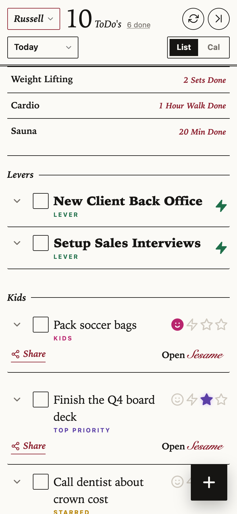
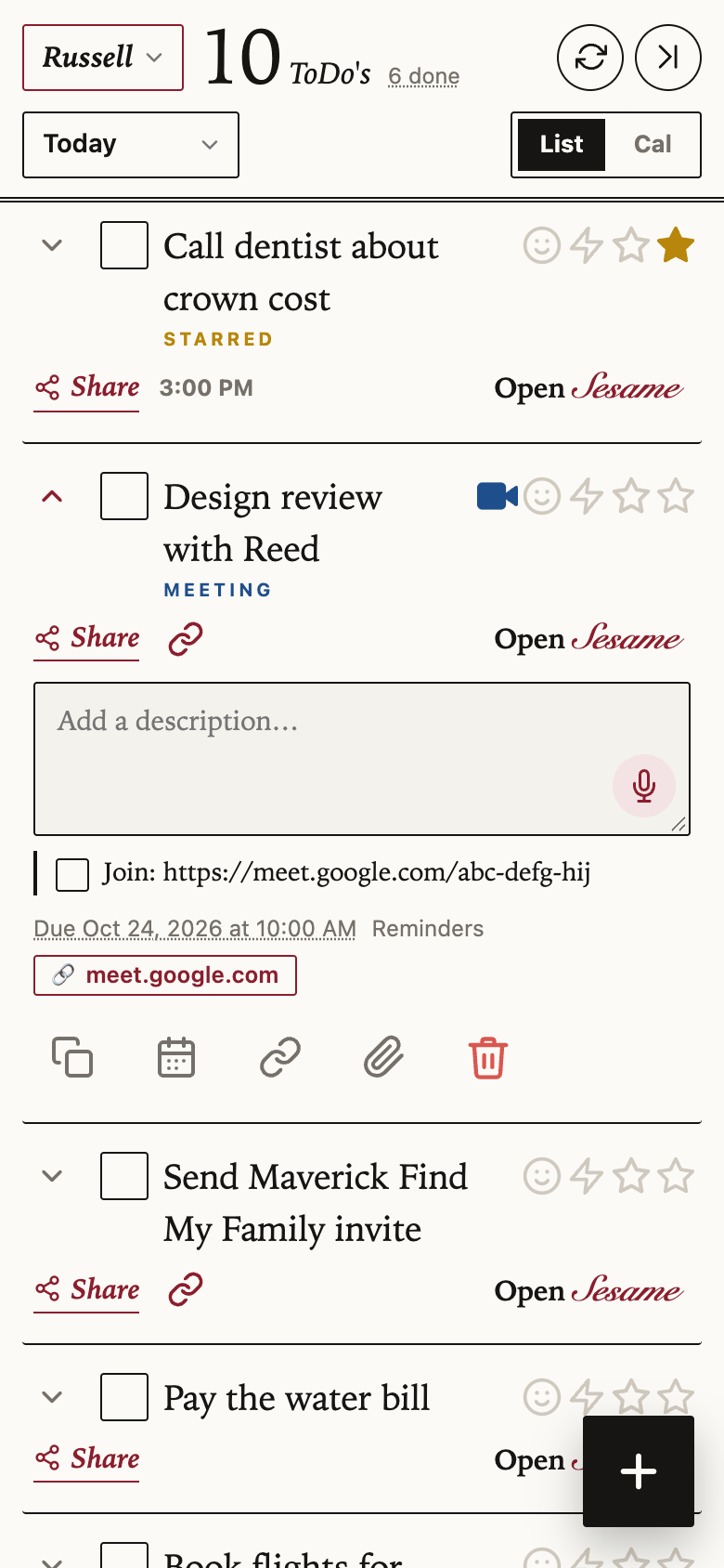
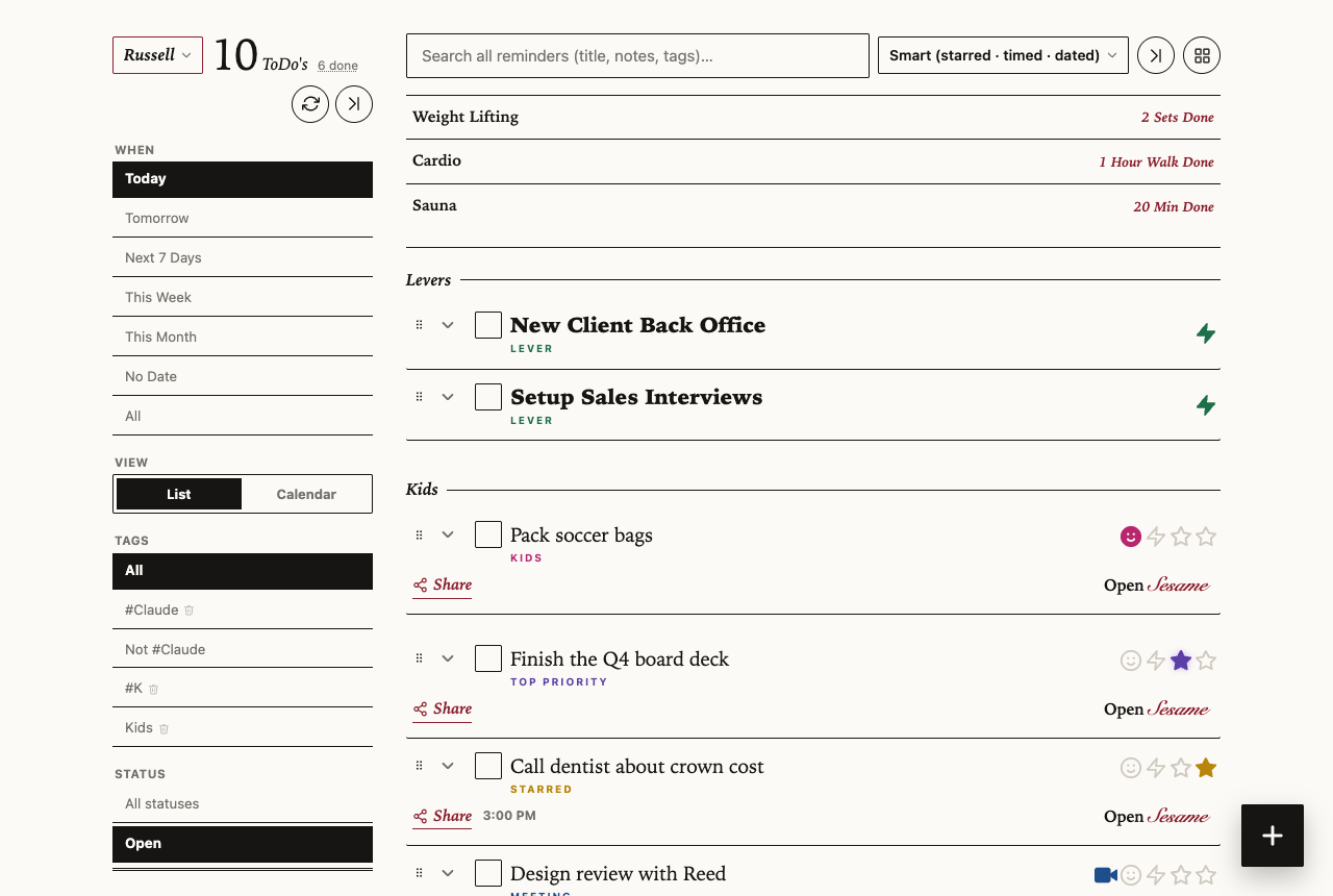
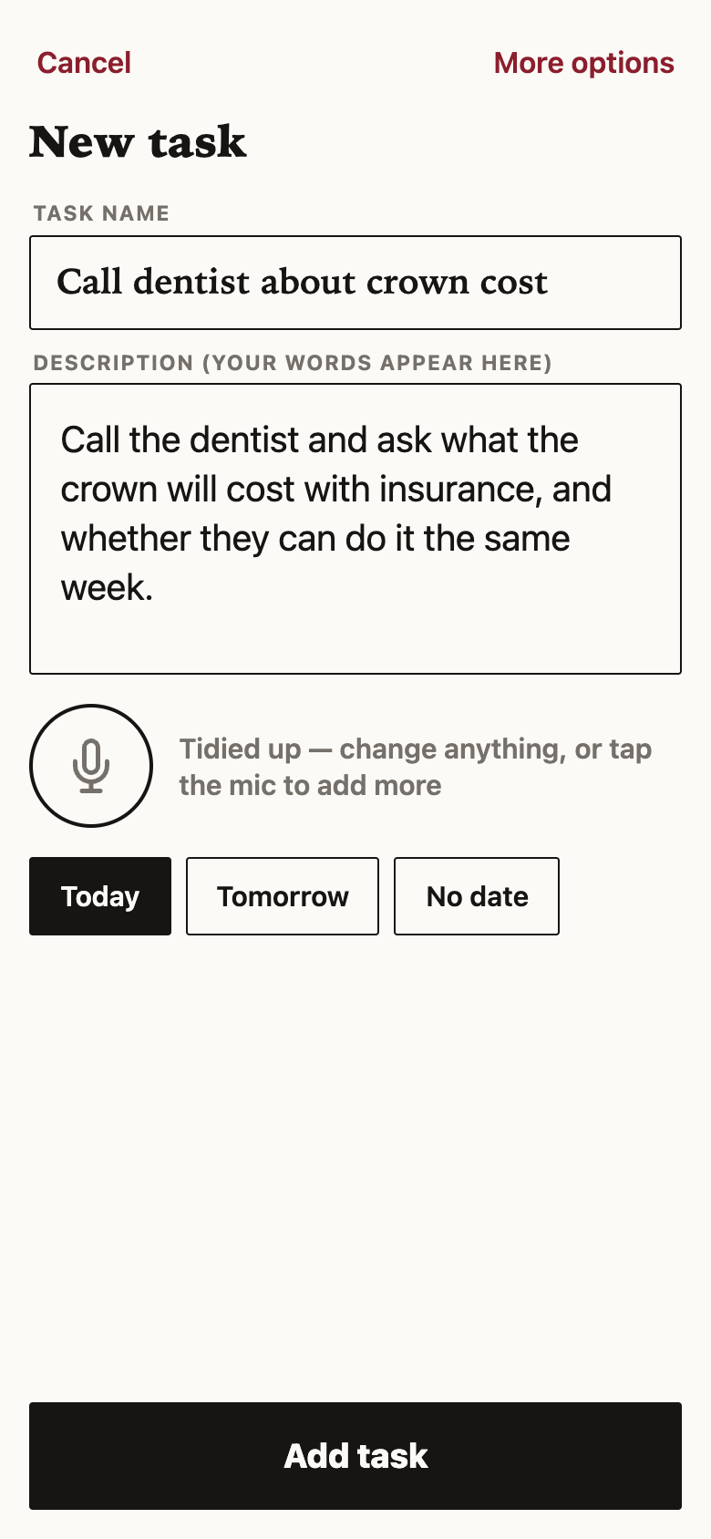
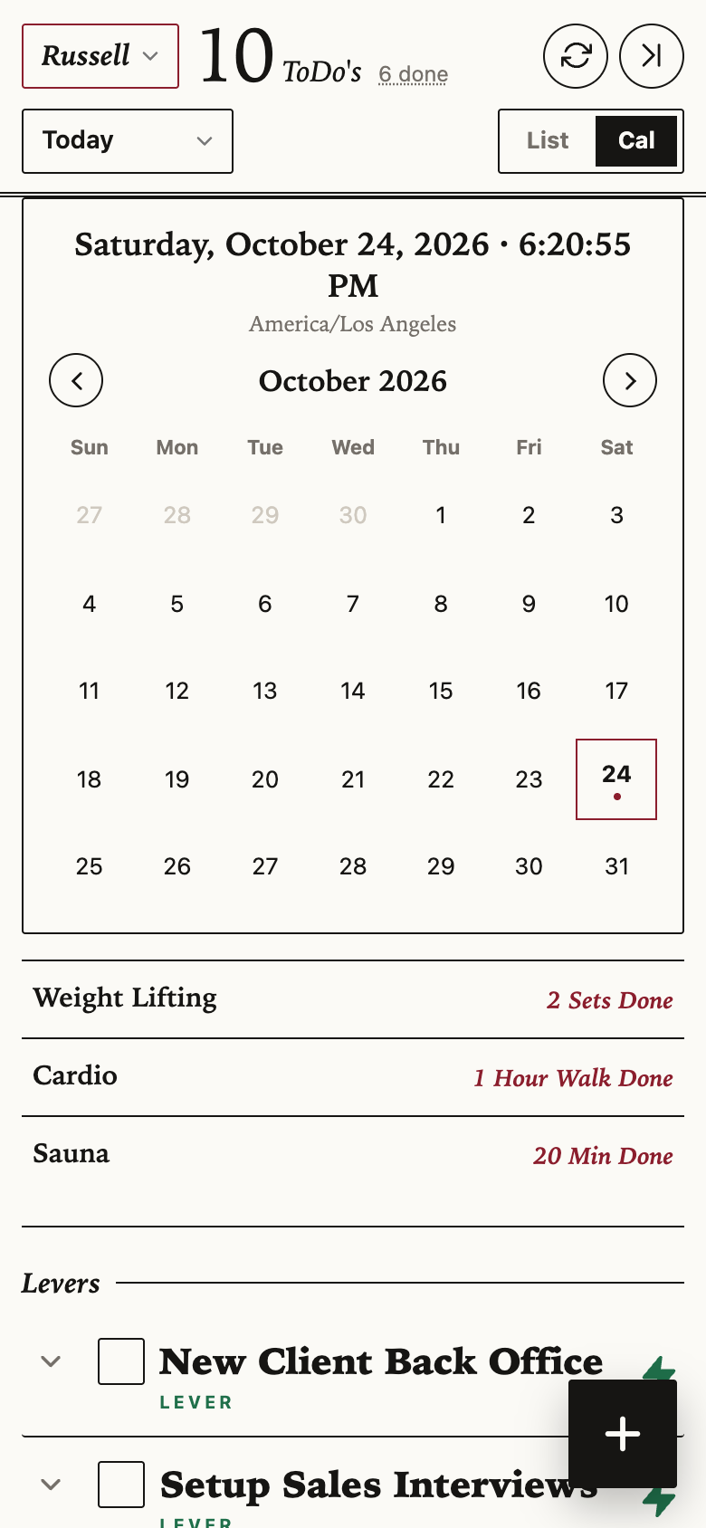
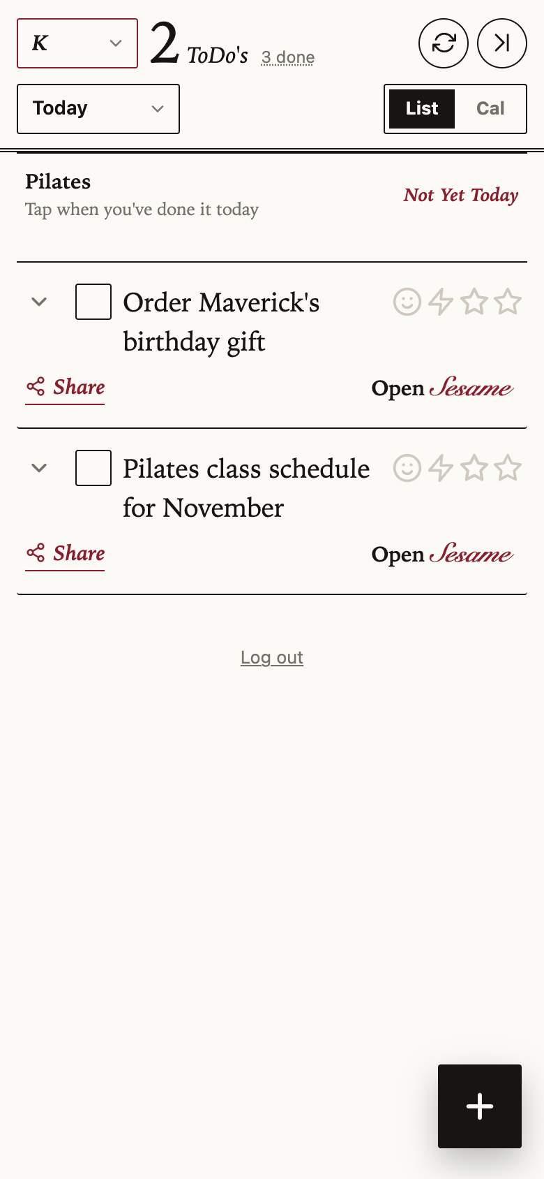
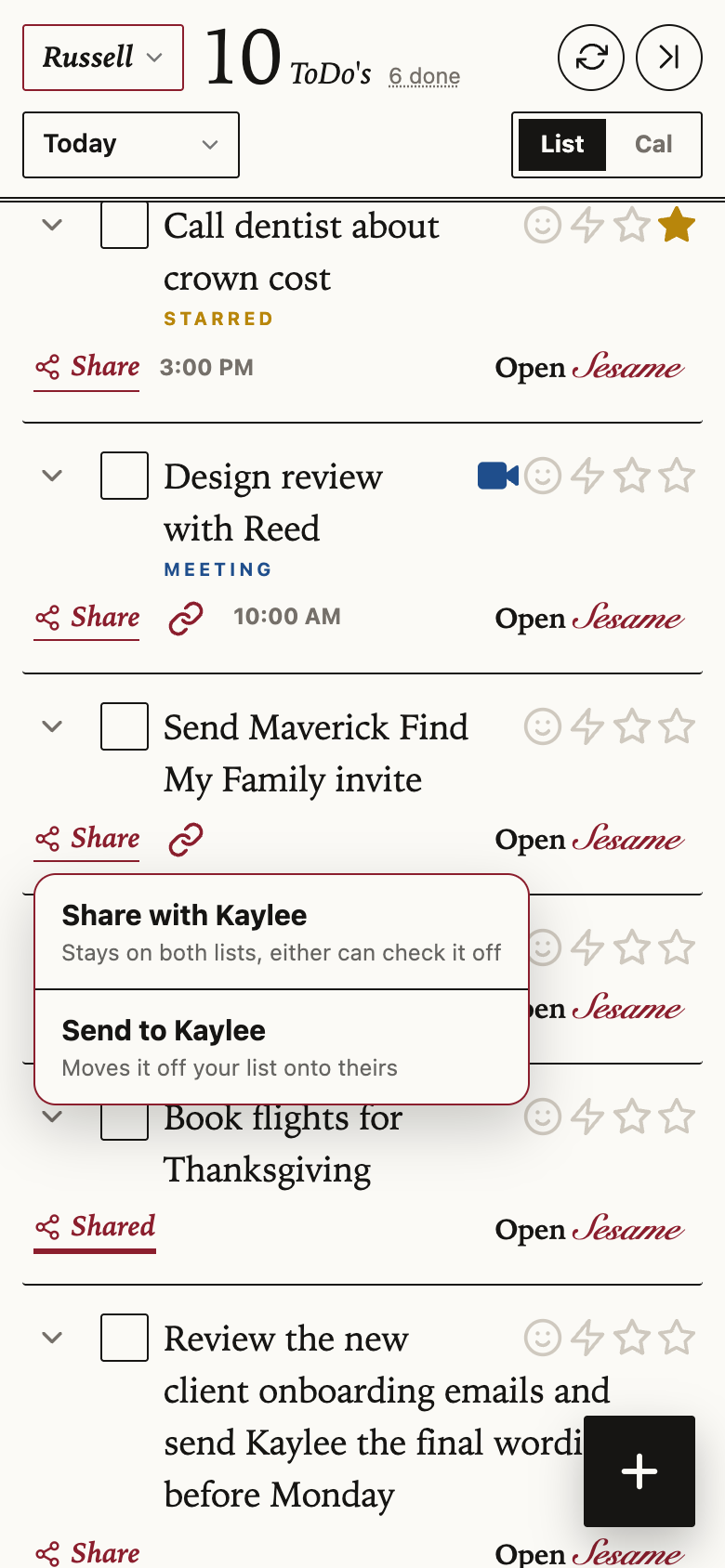
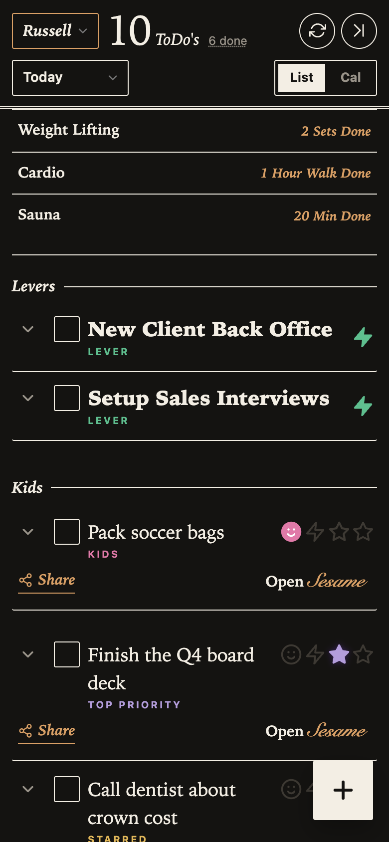
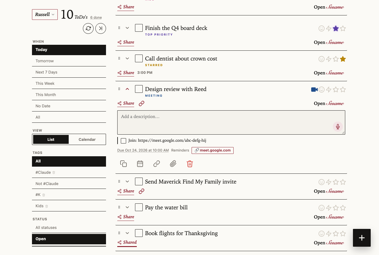
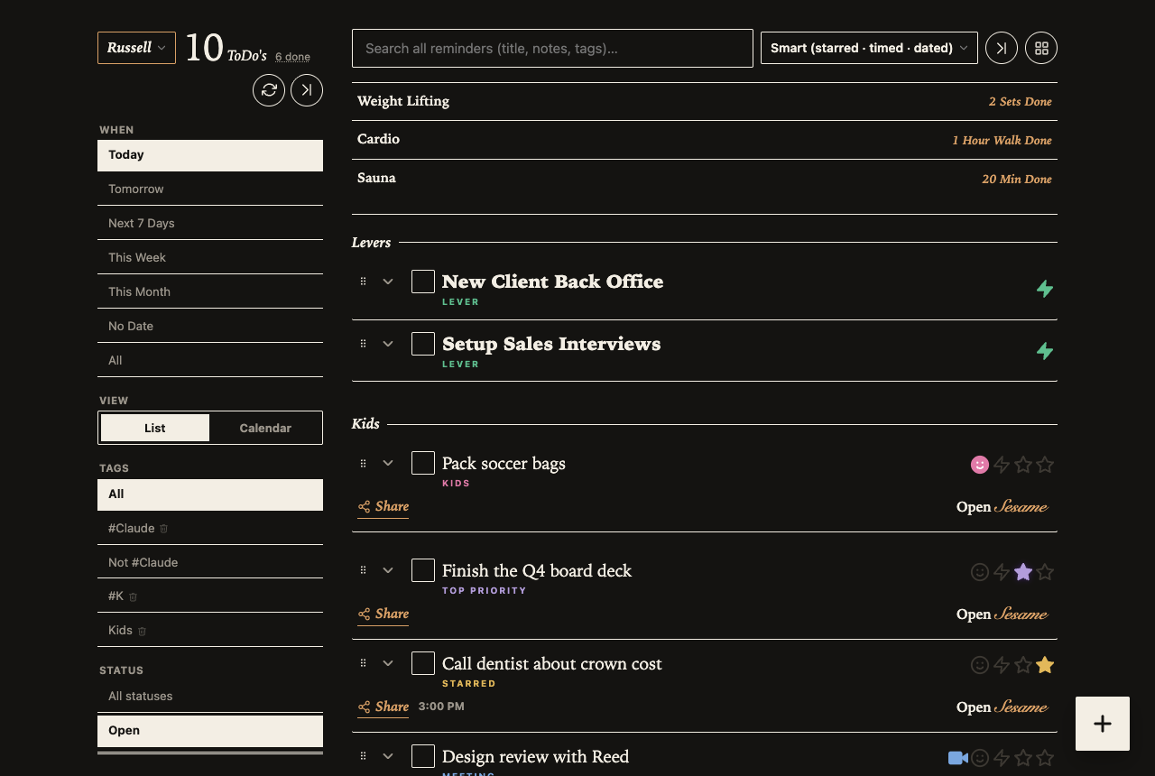
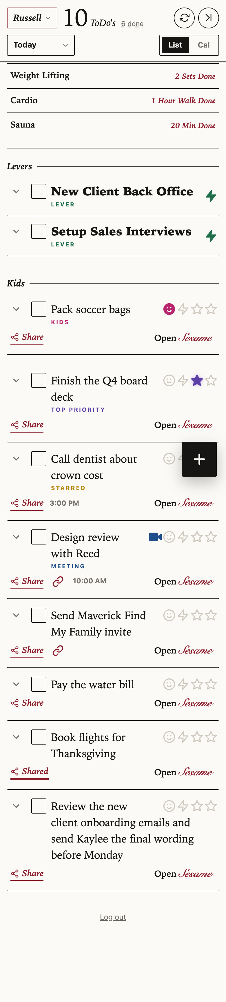
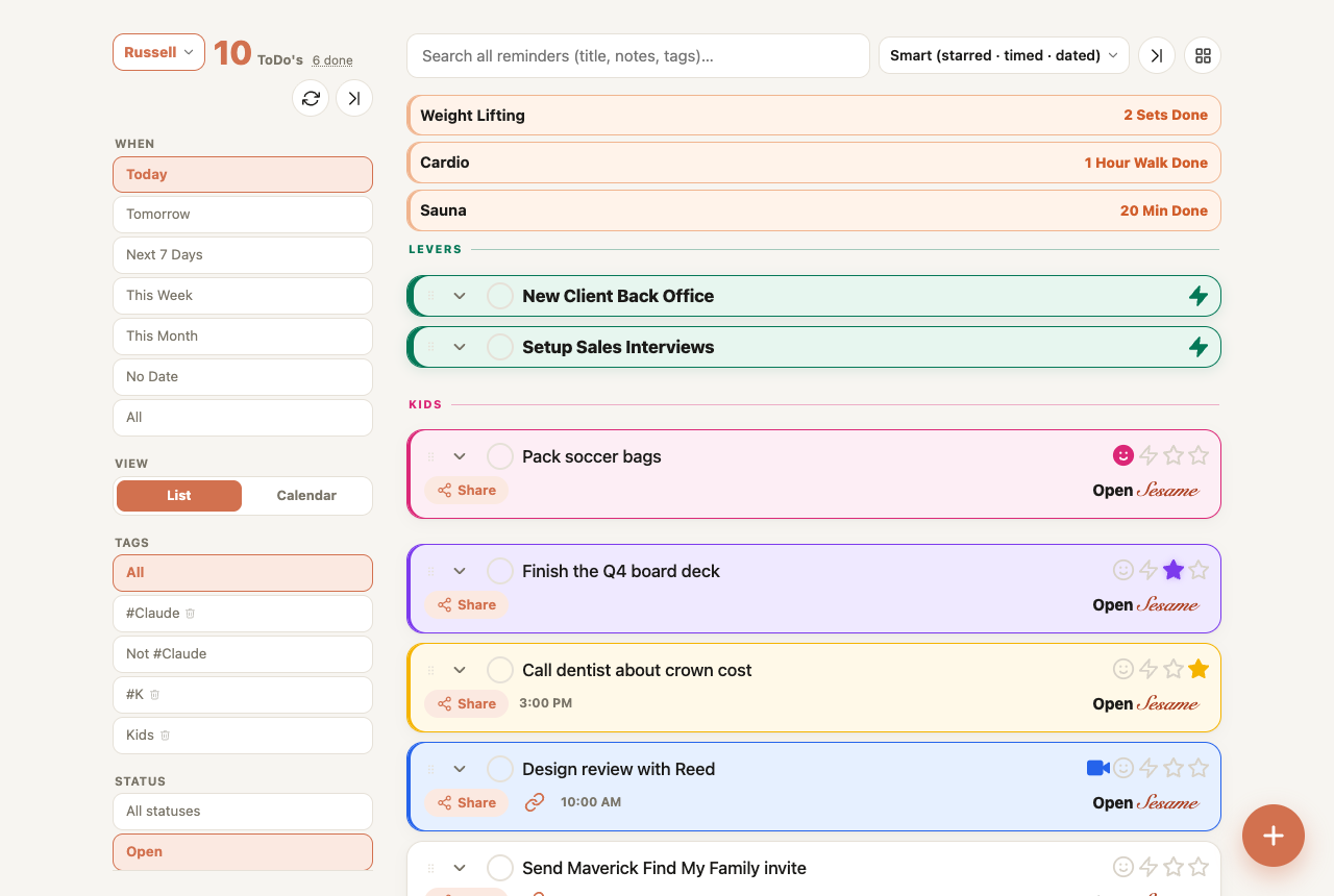
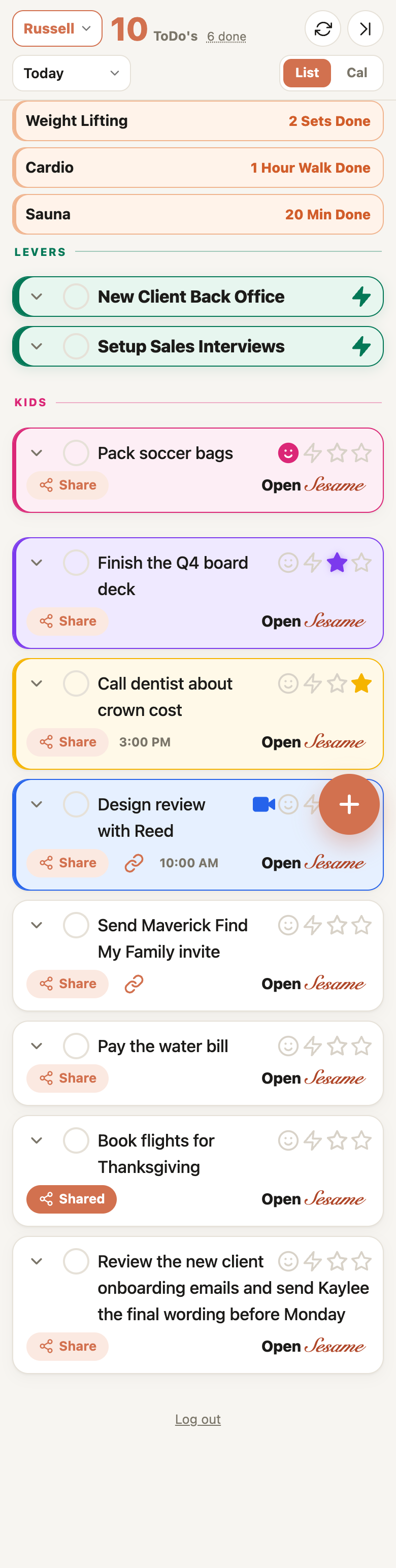
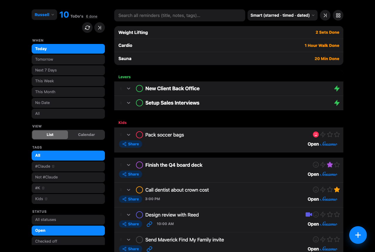
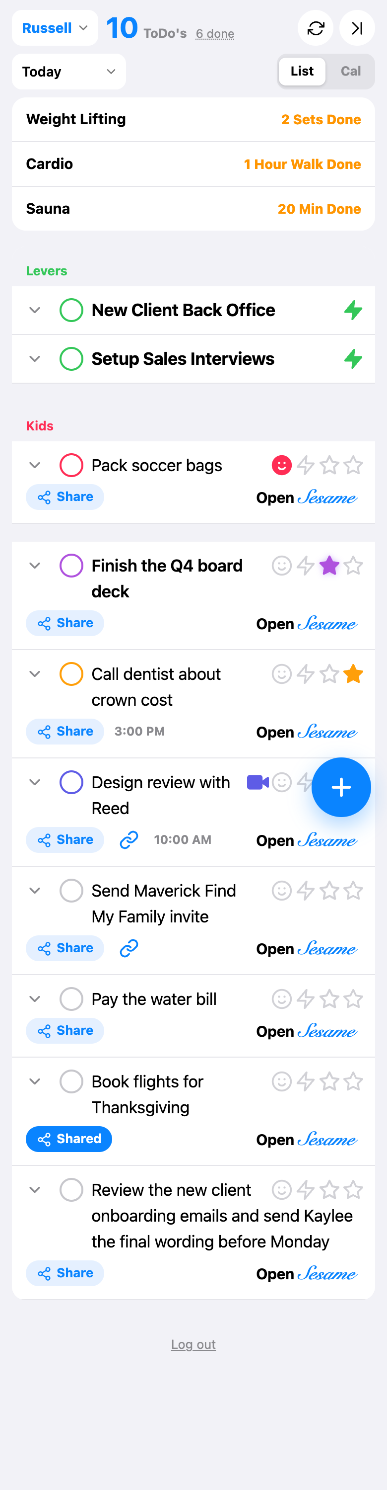
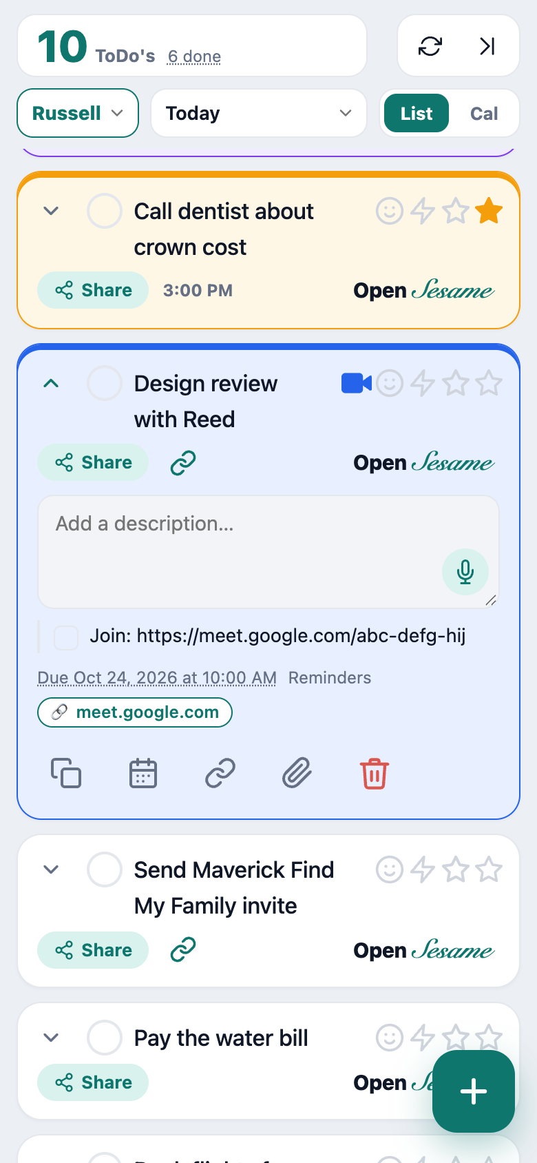
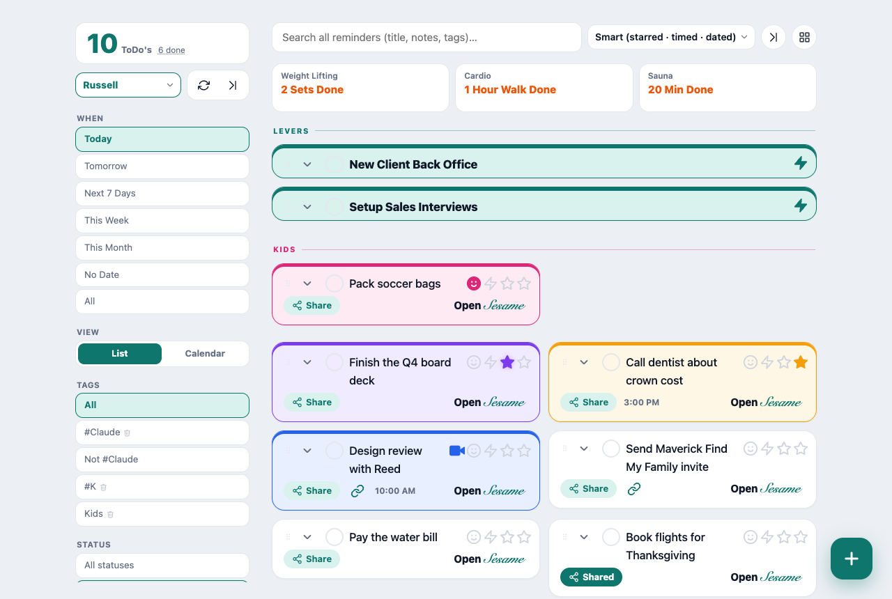
Today's look, for reference
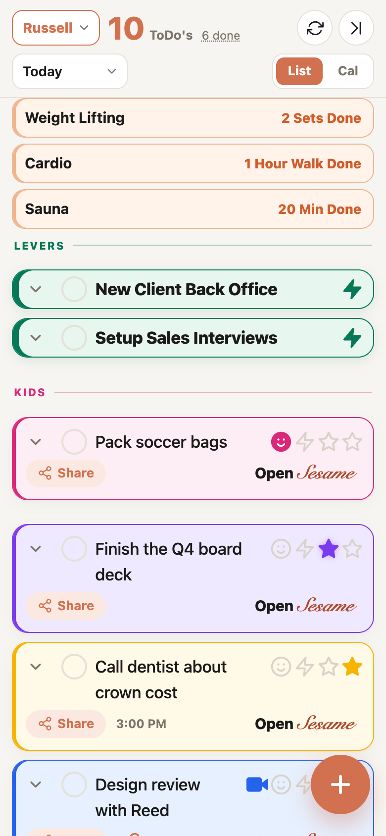
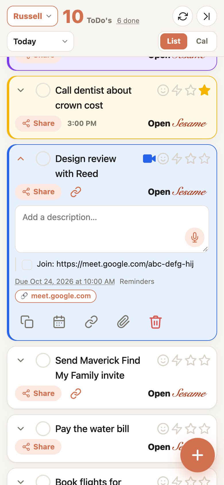
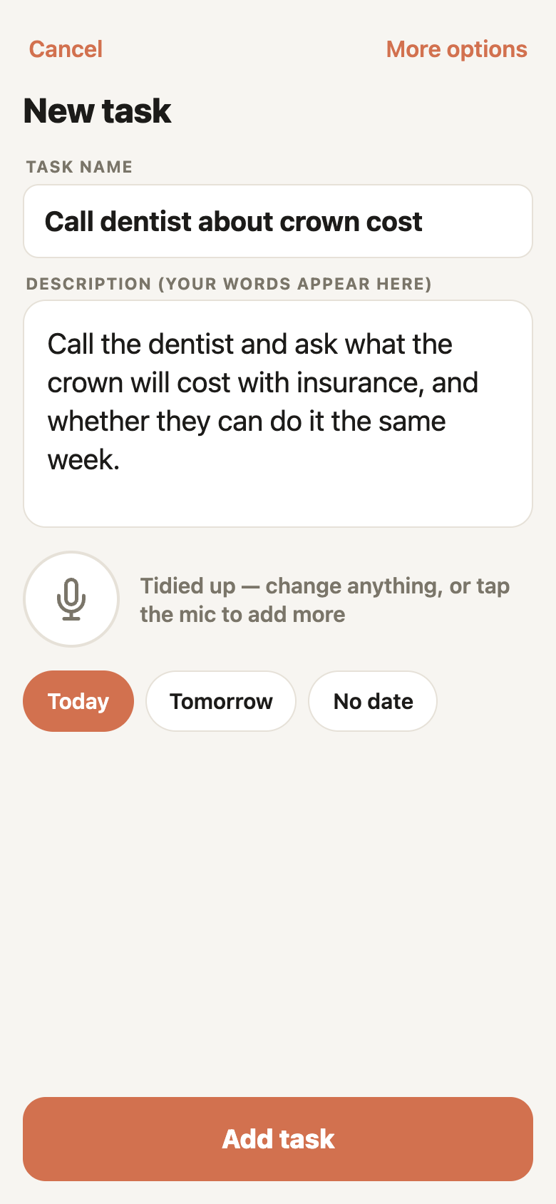
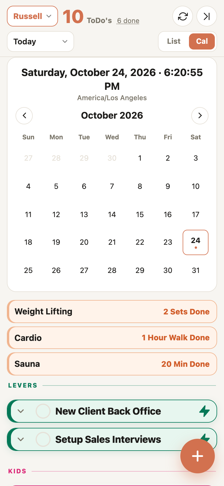
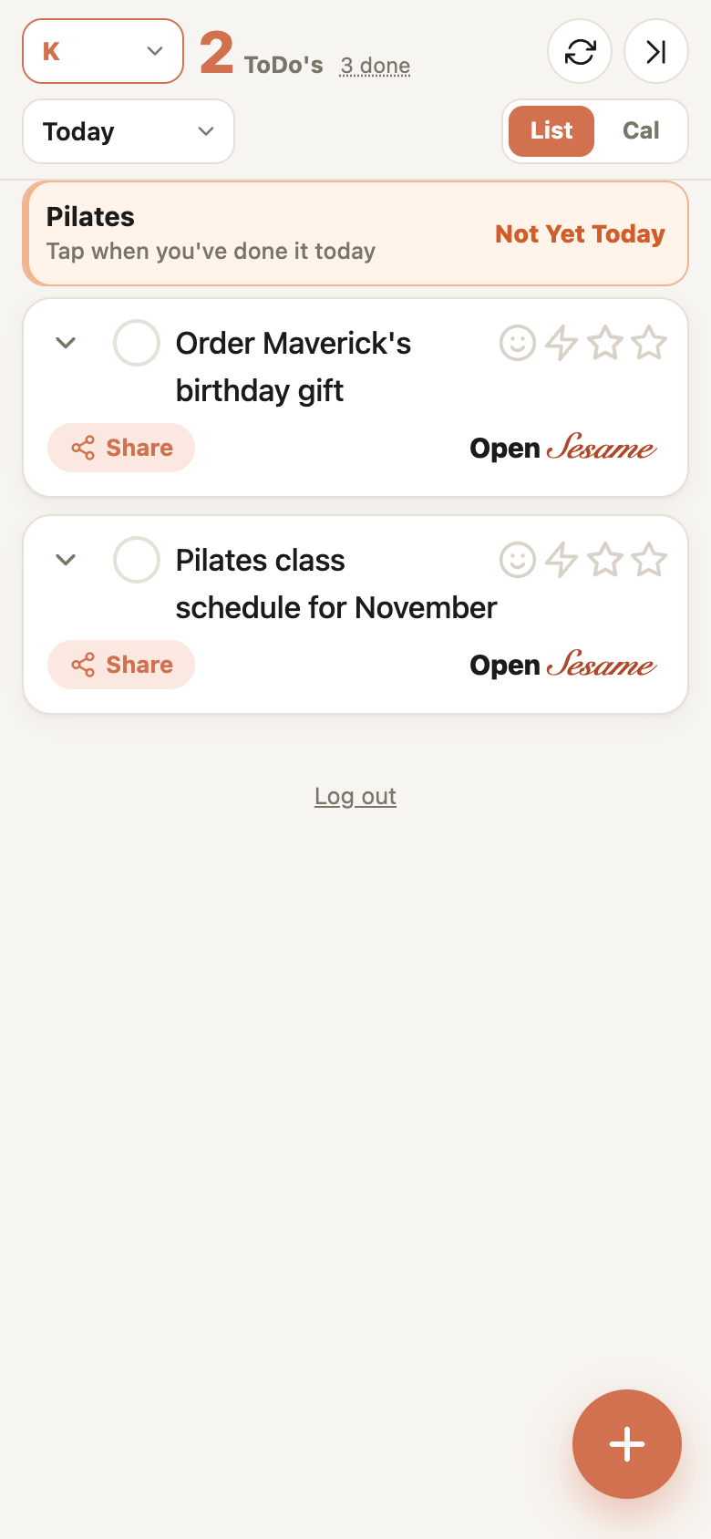
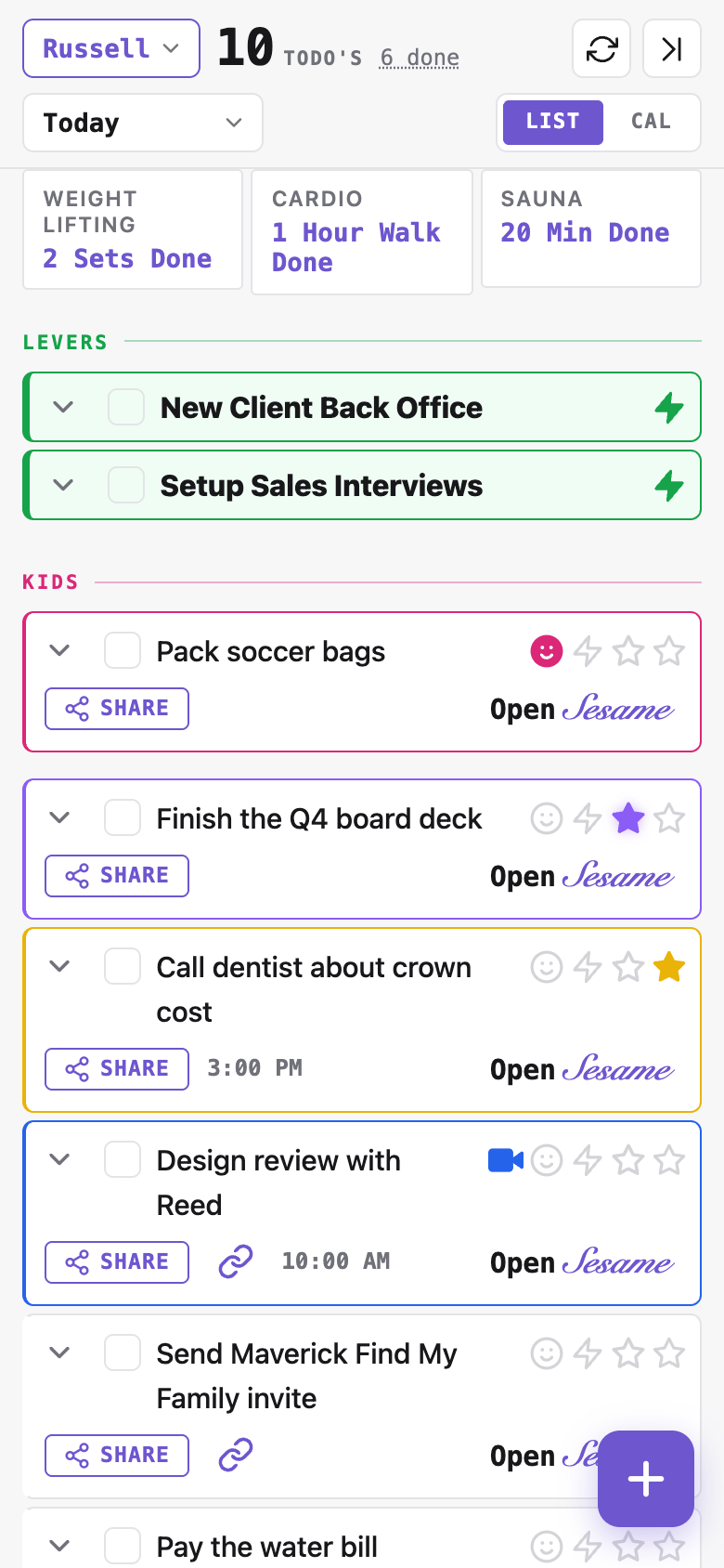
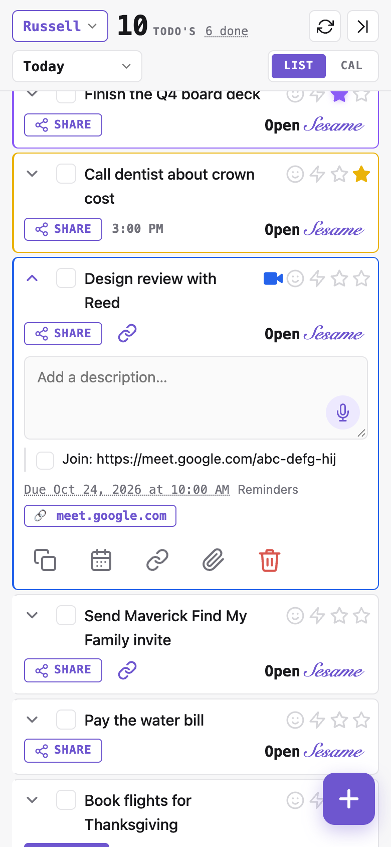
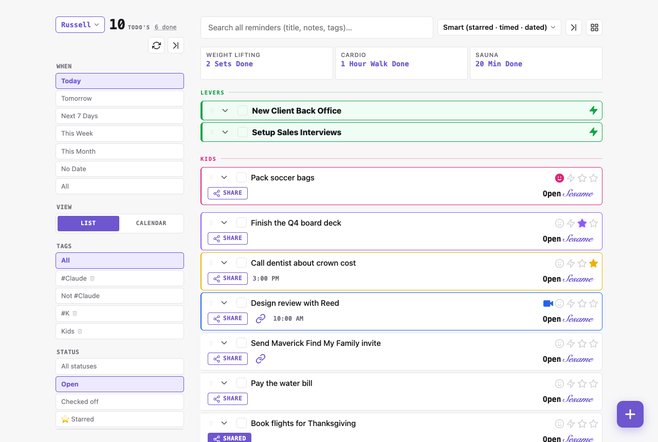
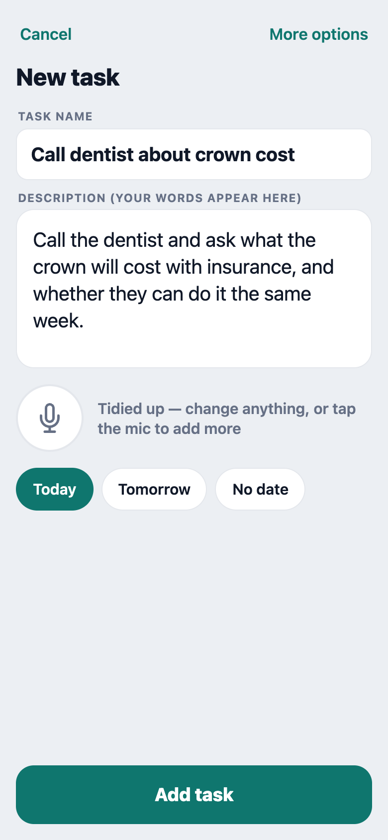
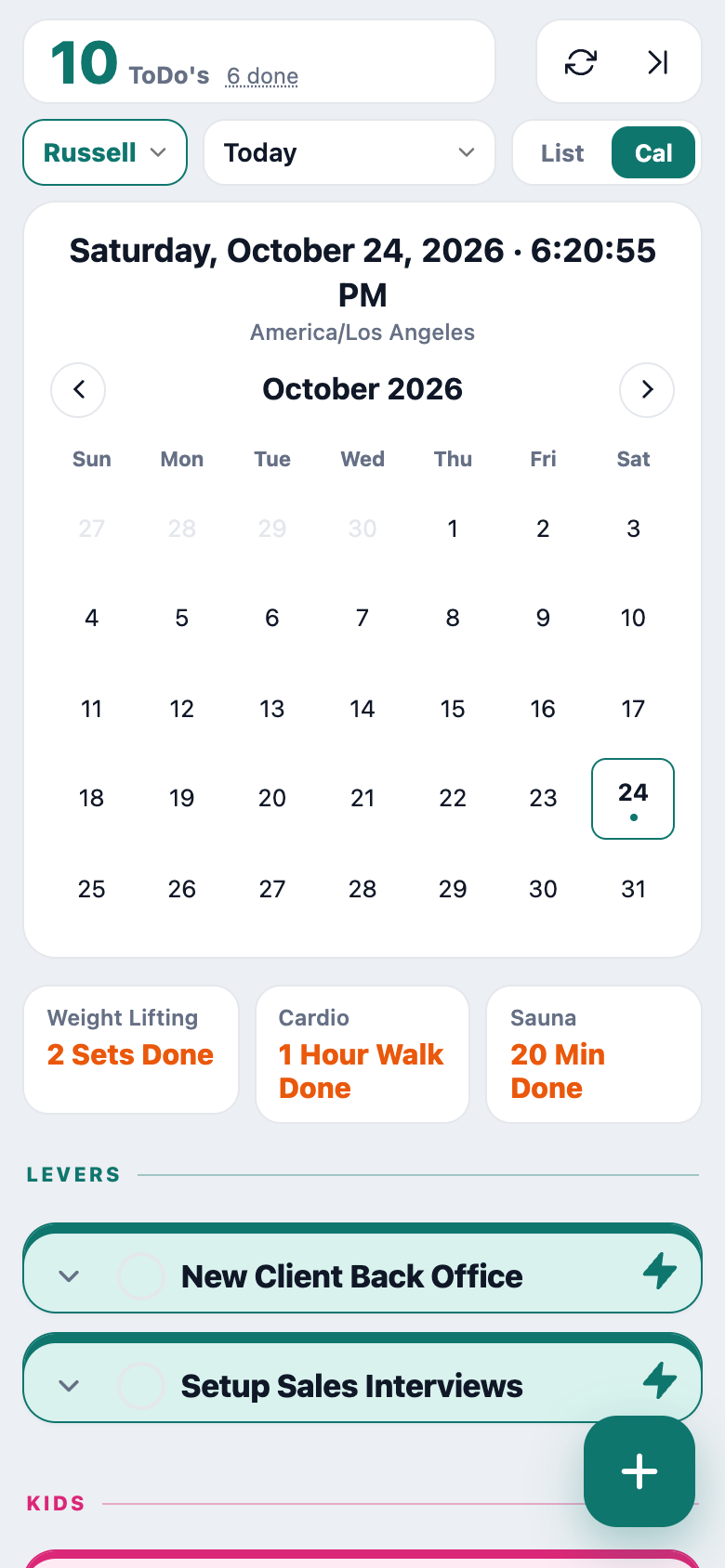
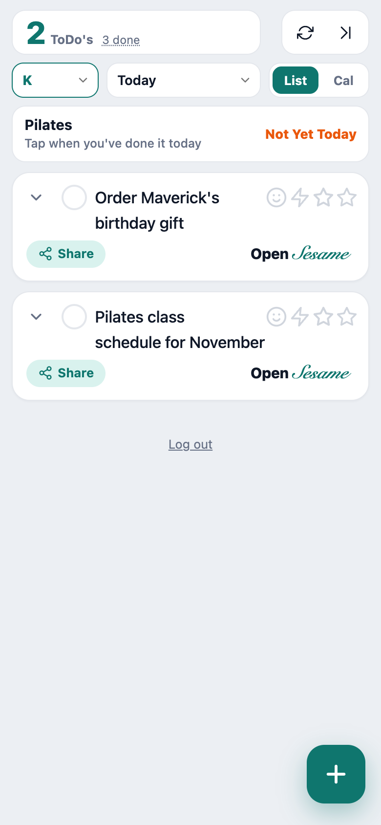
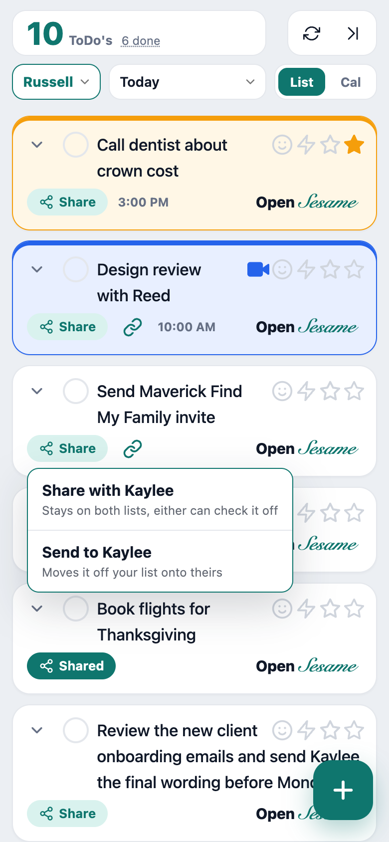
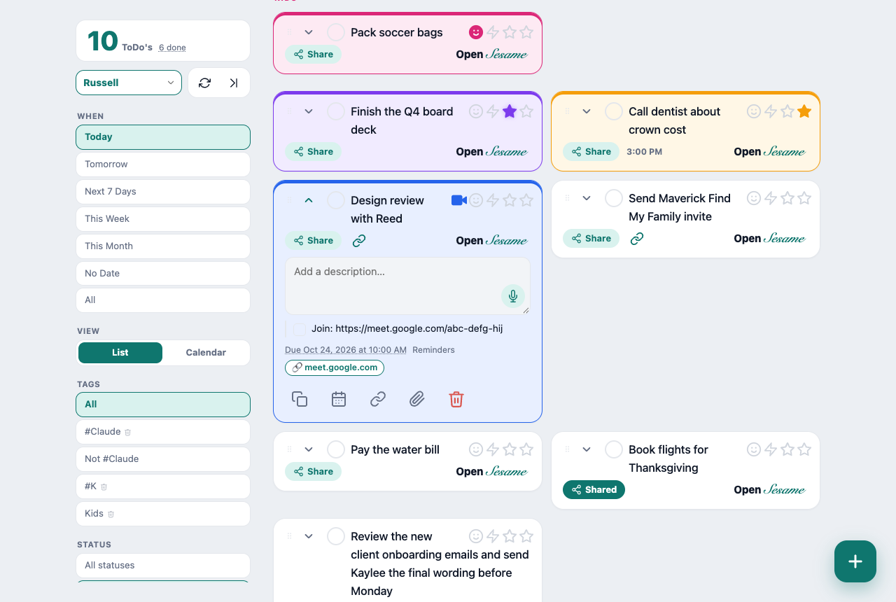
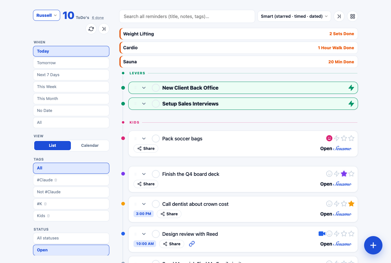
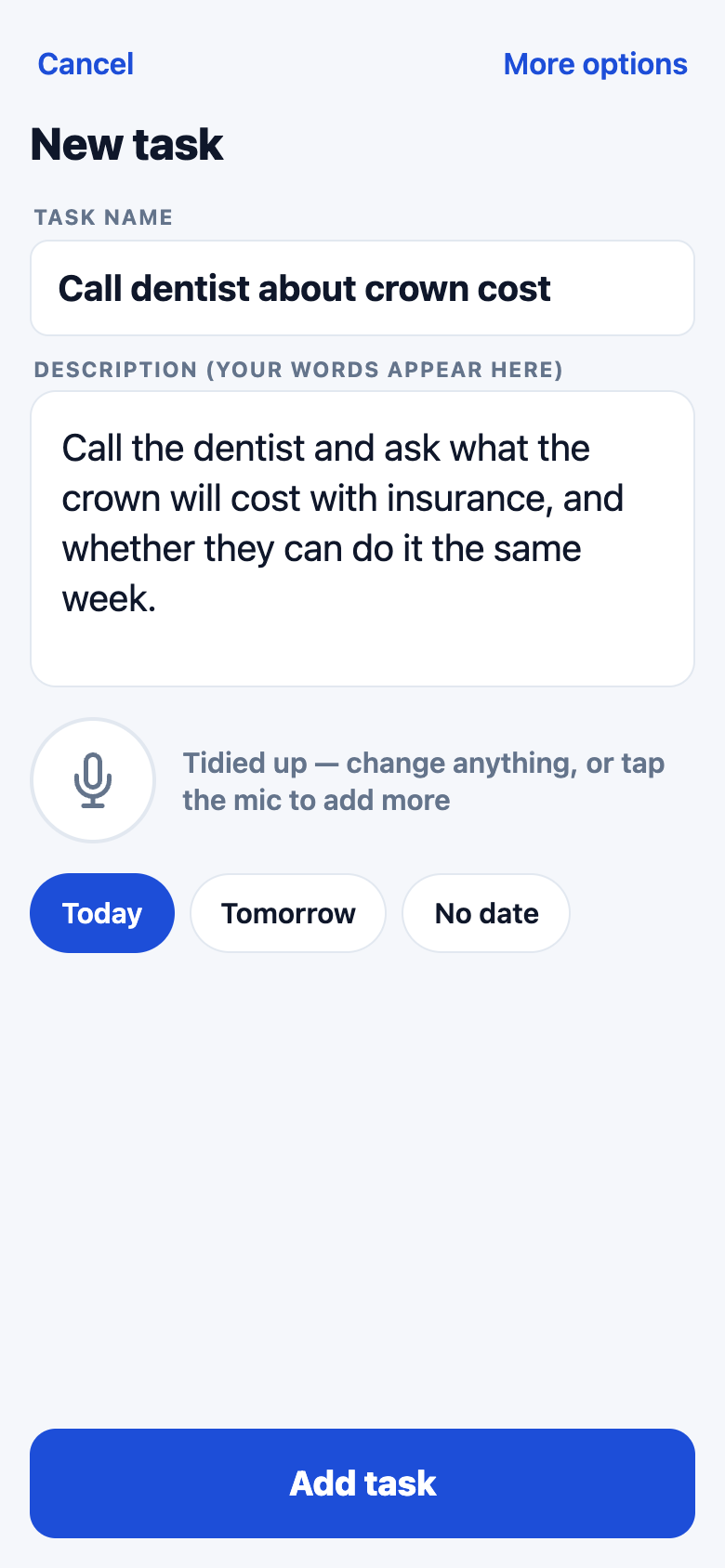
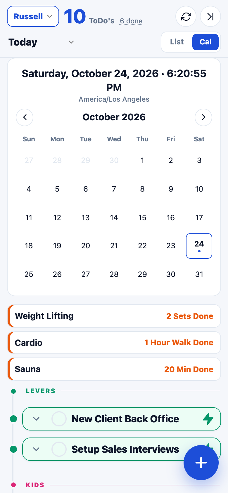
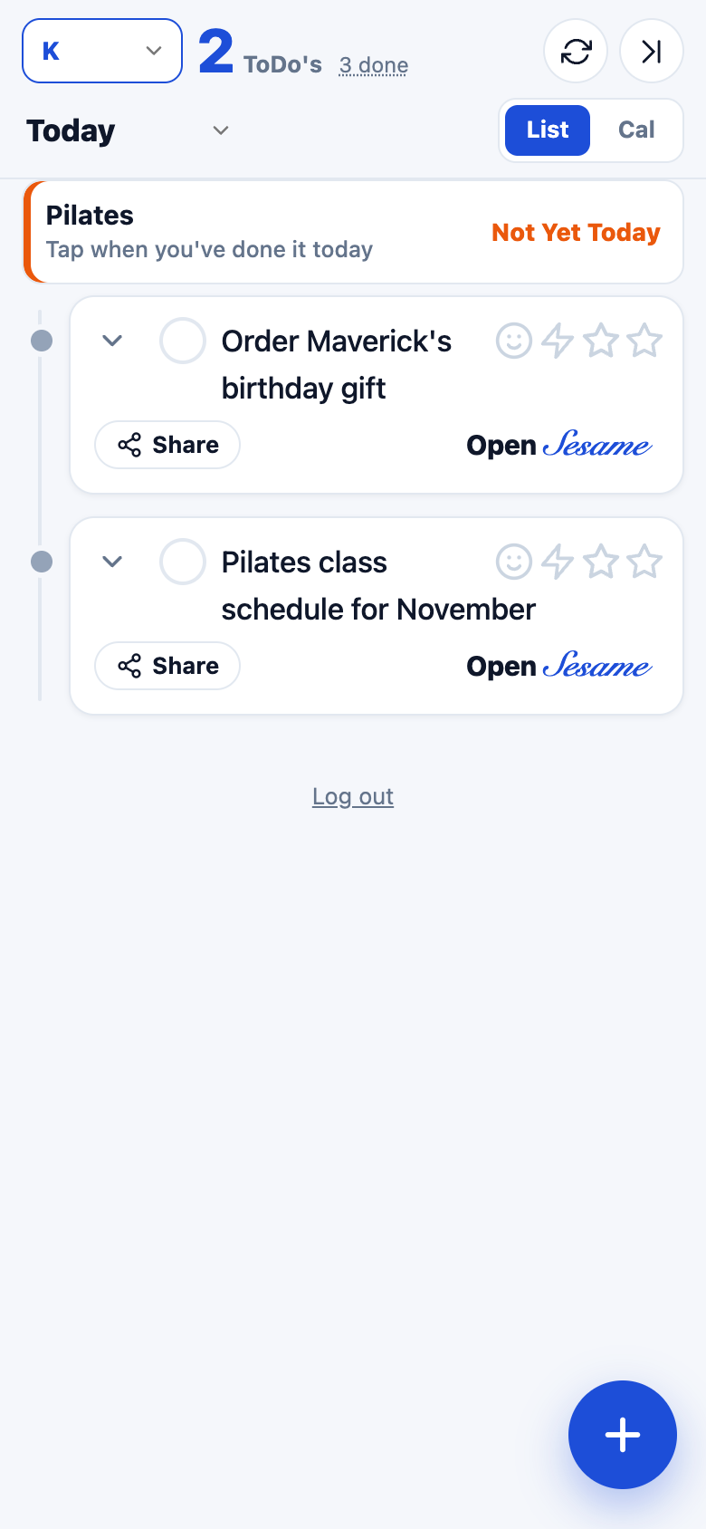
The current app, same sample data
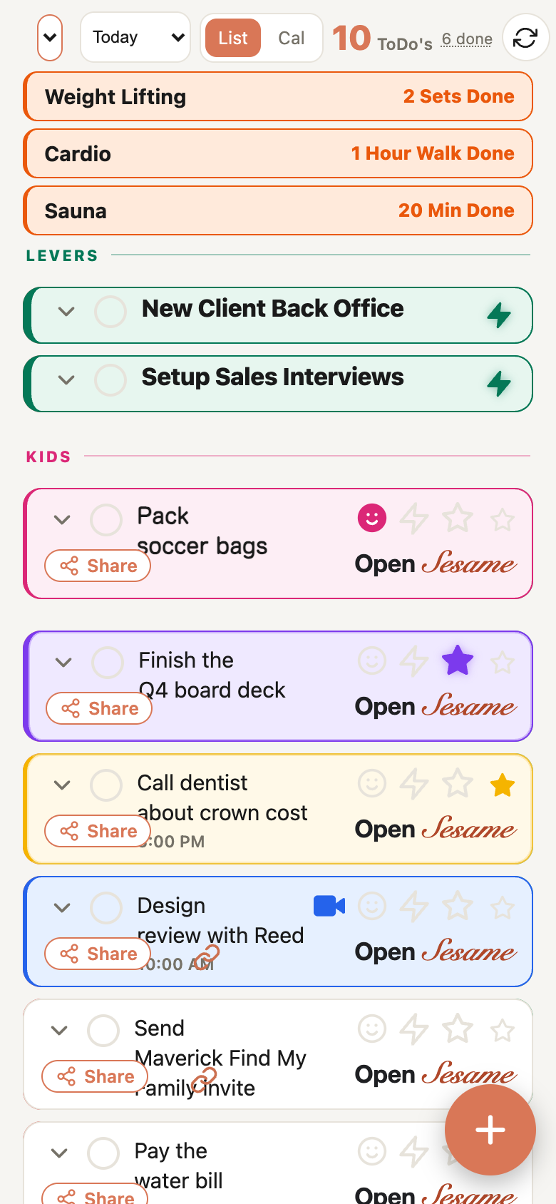
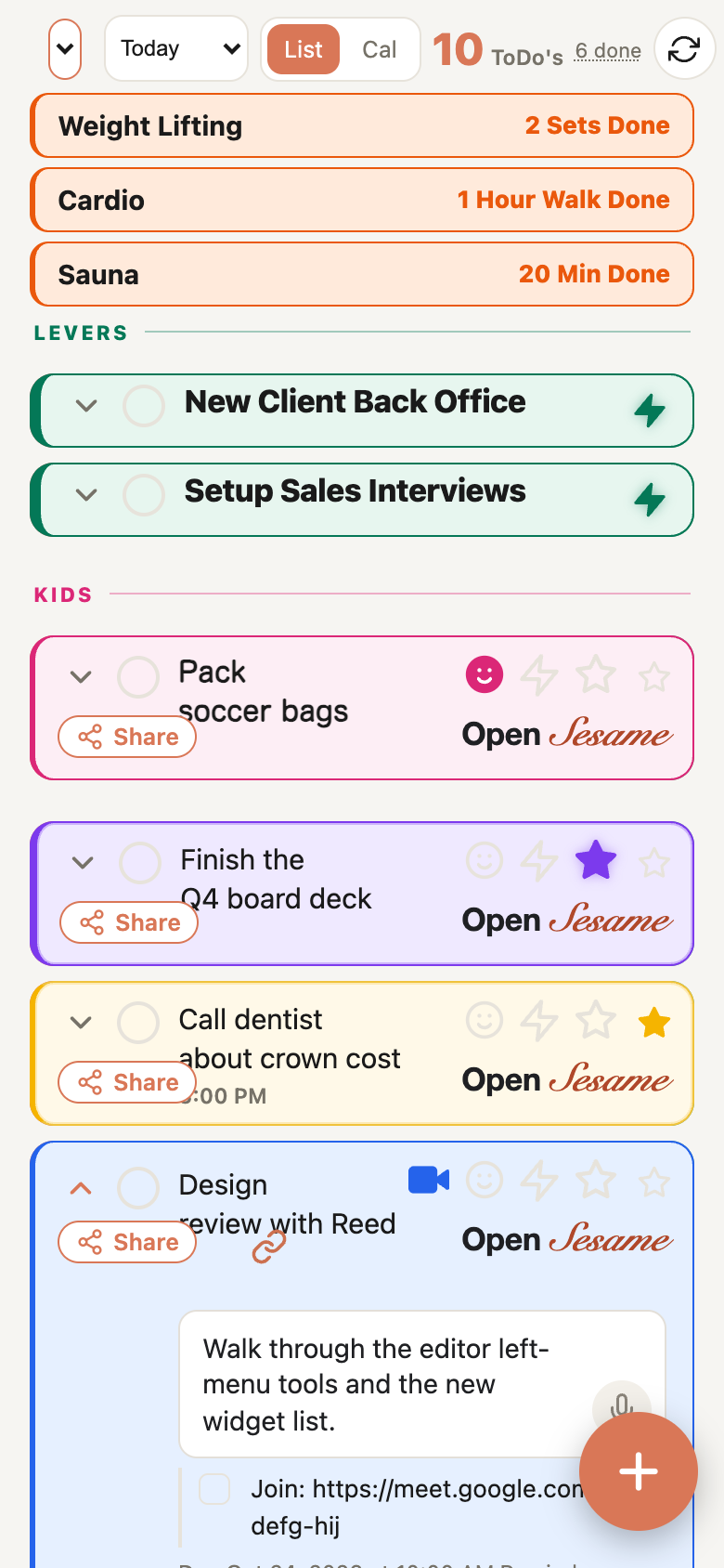
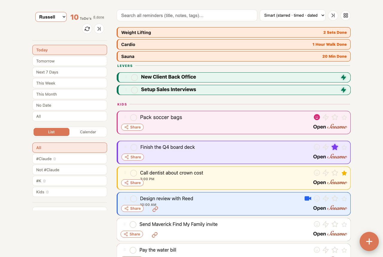
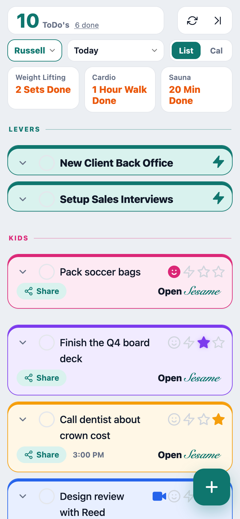
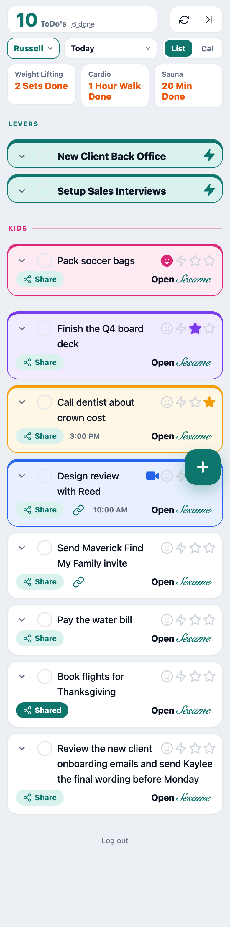
Warm paper, terracotta, the header finally fits a phone, and the labels no longer land on top of long titles. Everything sits where you put it.
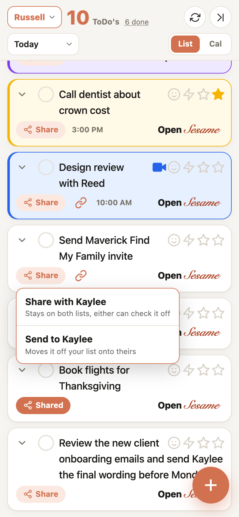
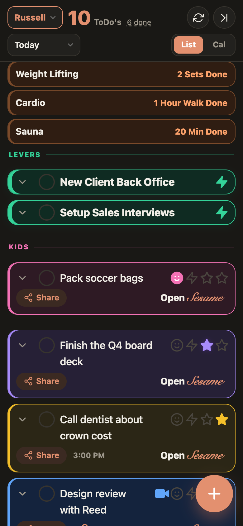
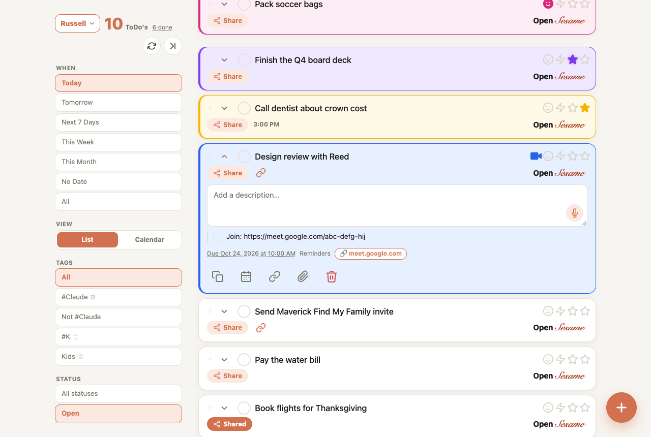
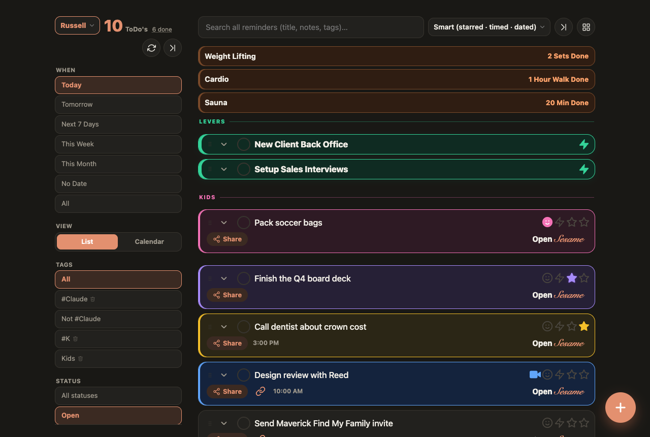
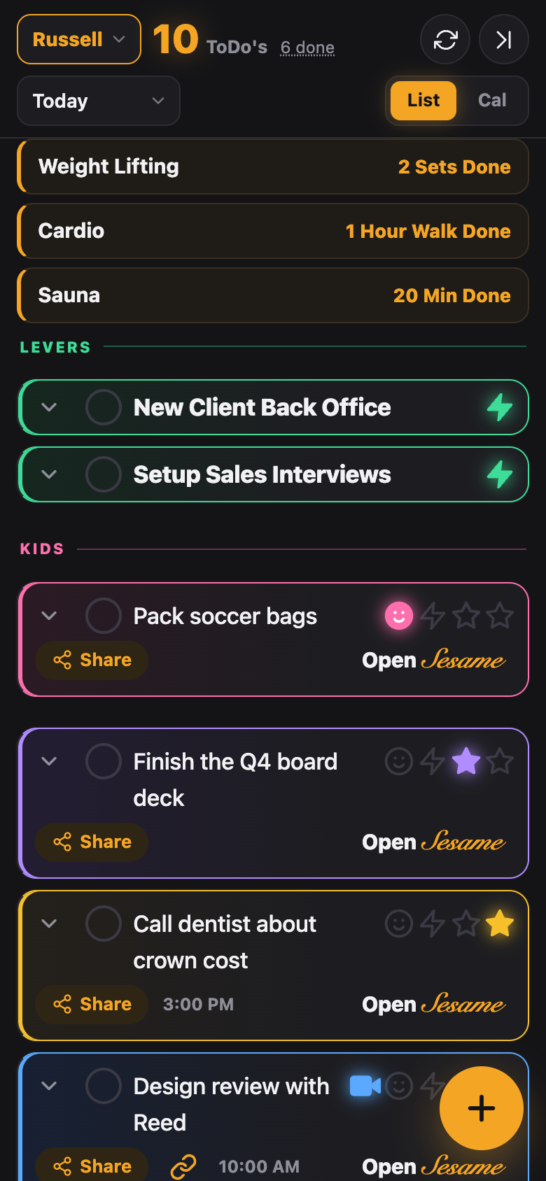
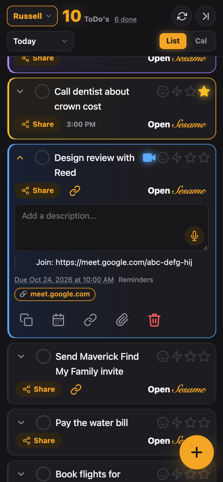
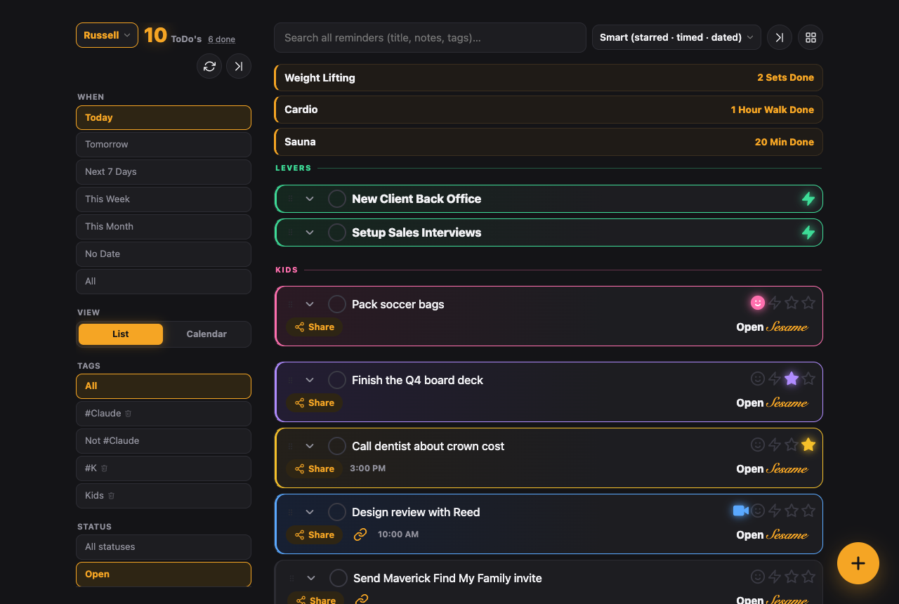
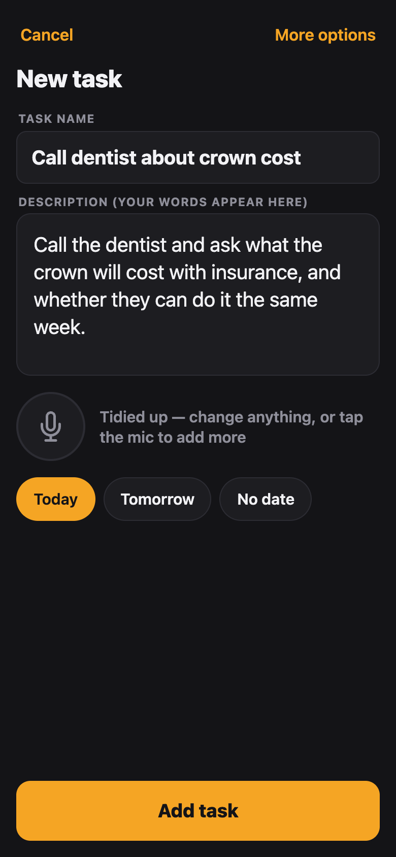
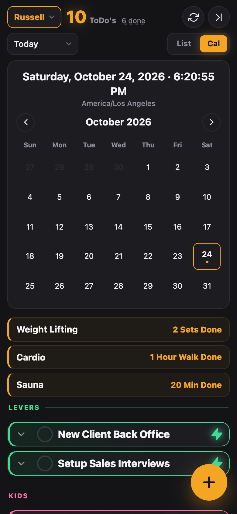
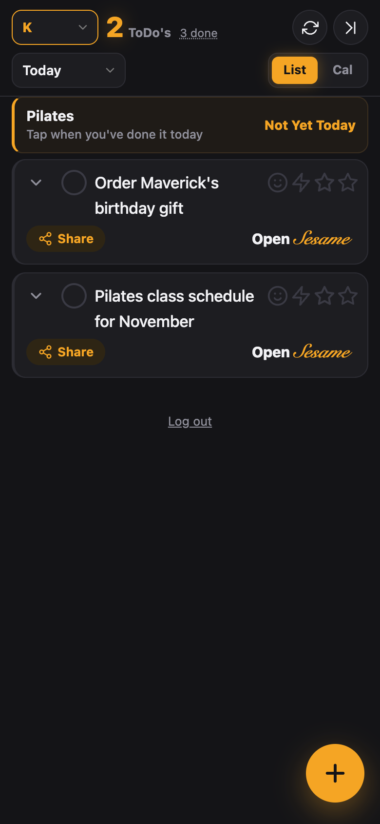
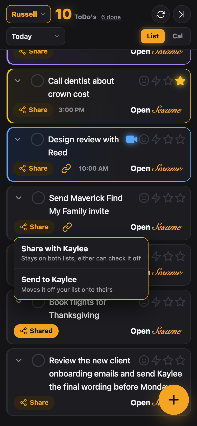
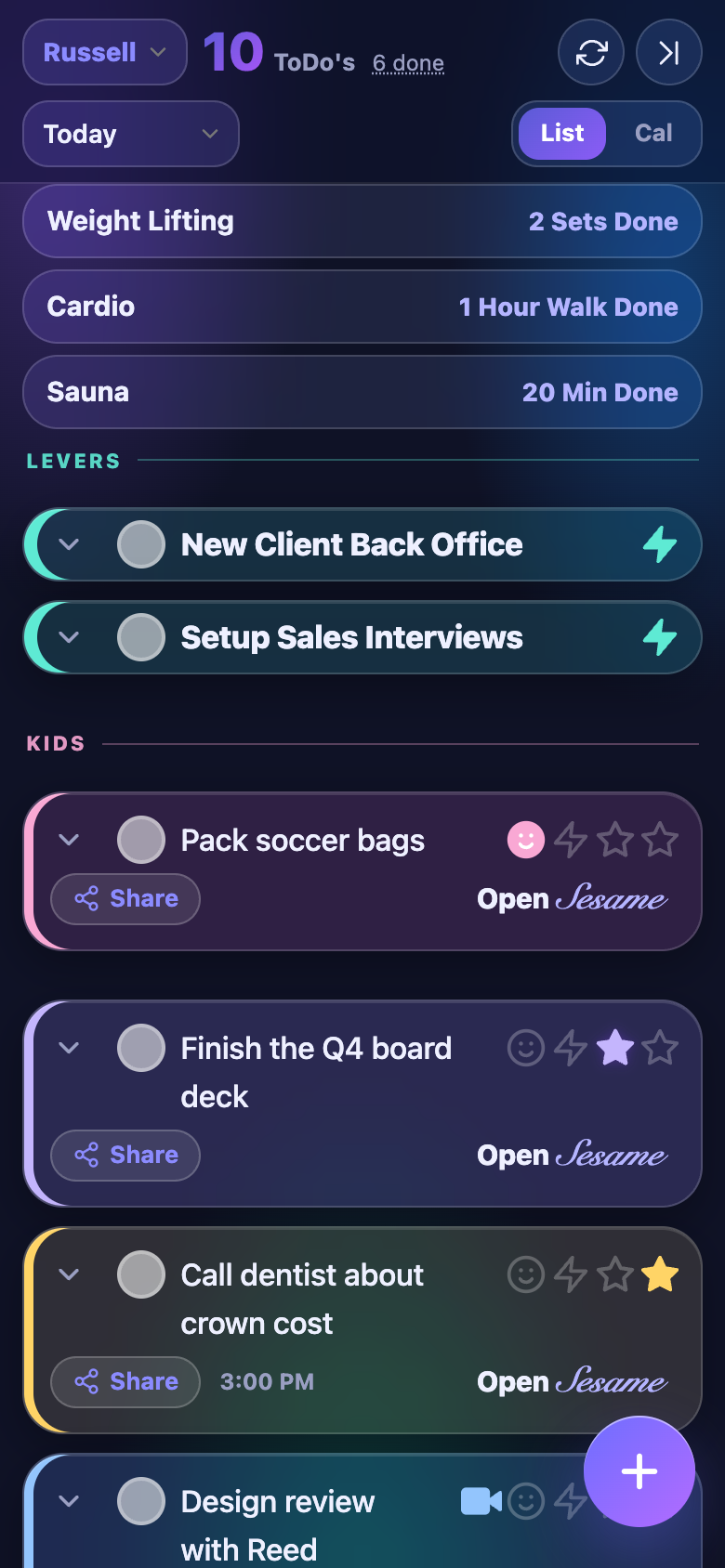
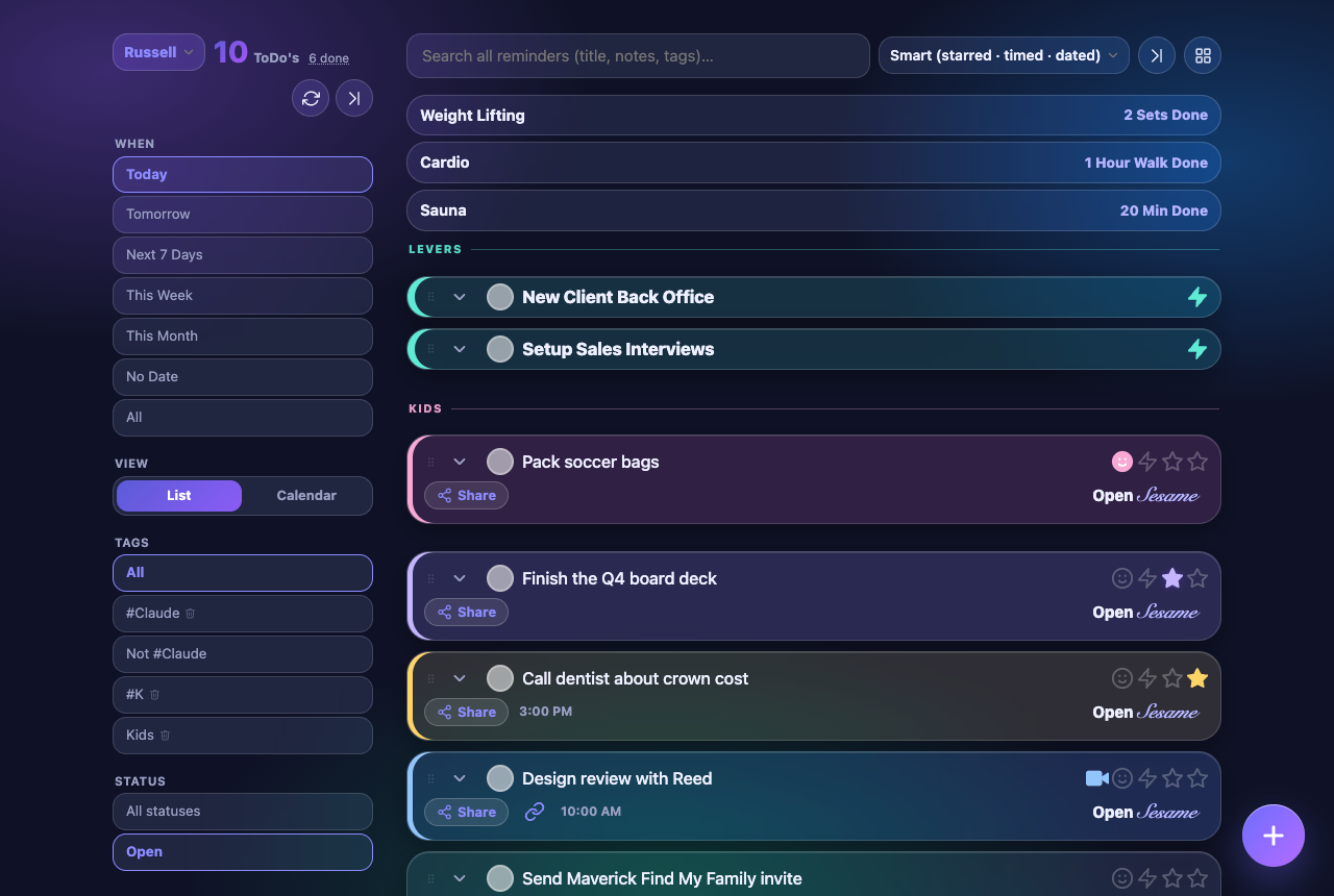
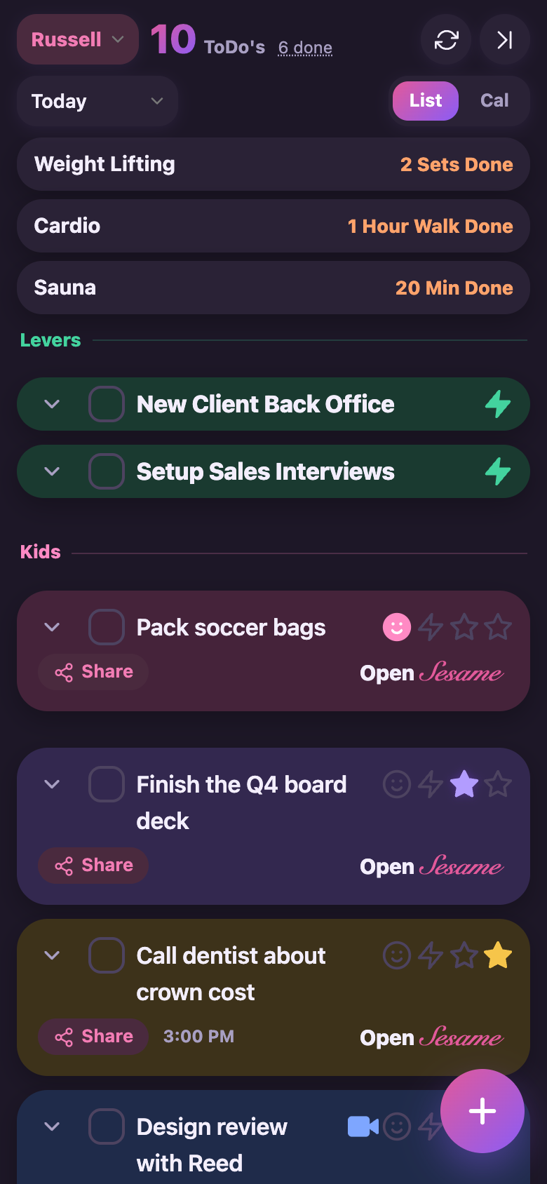
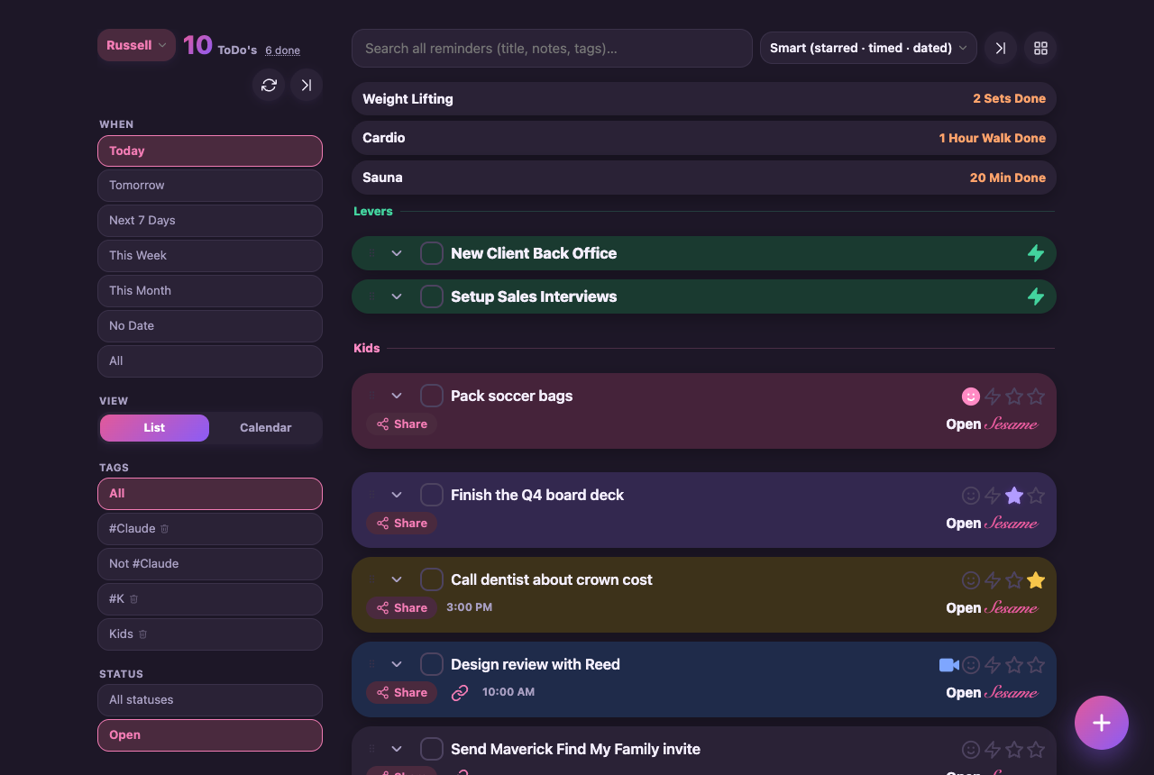
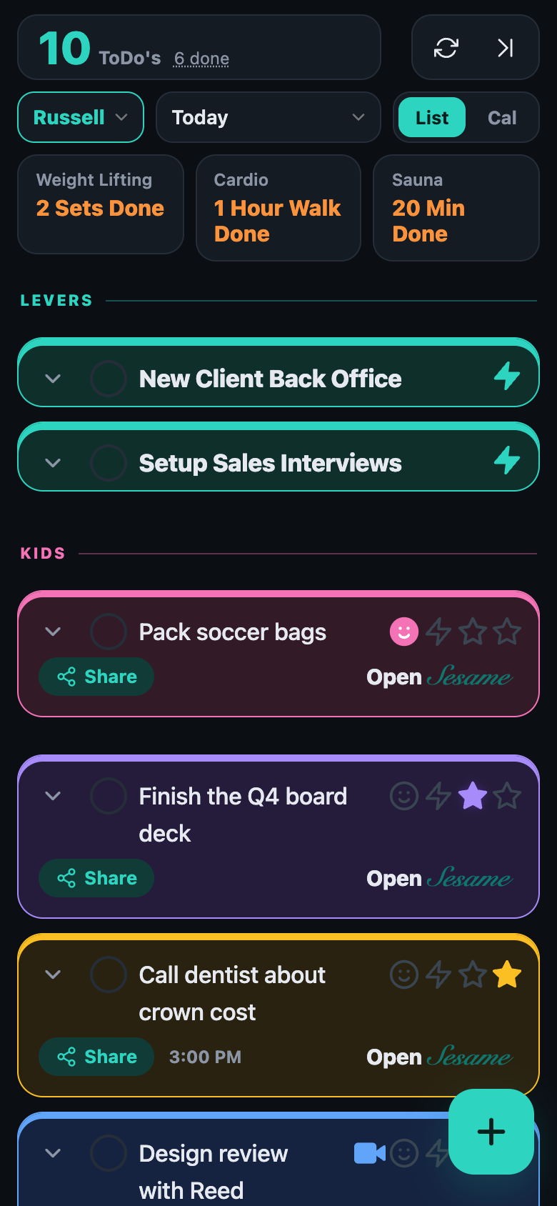
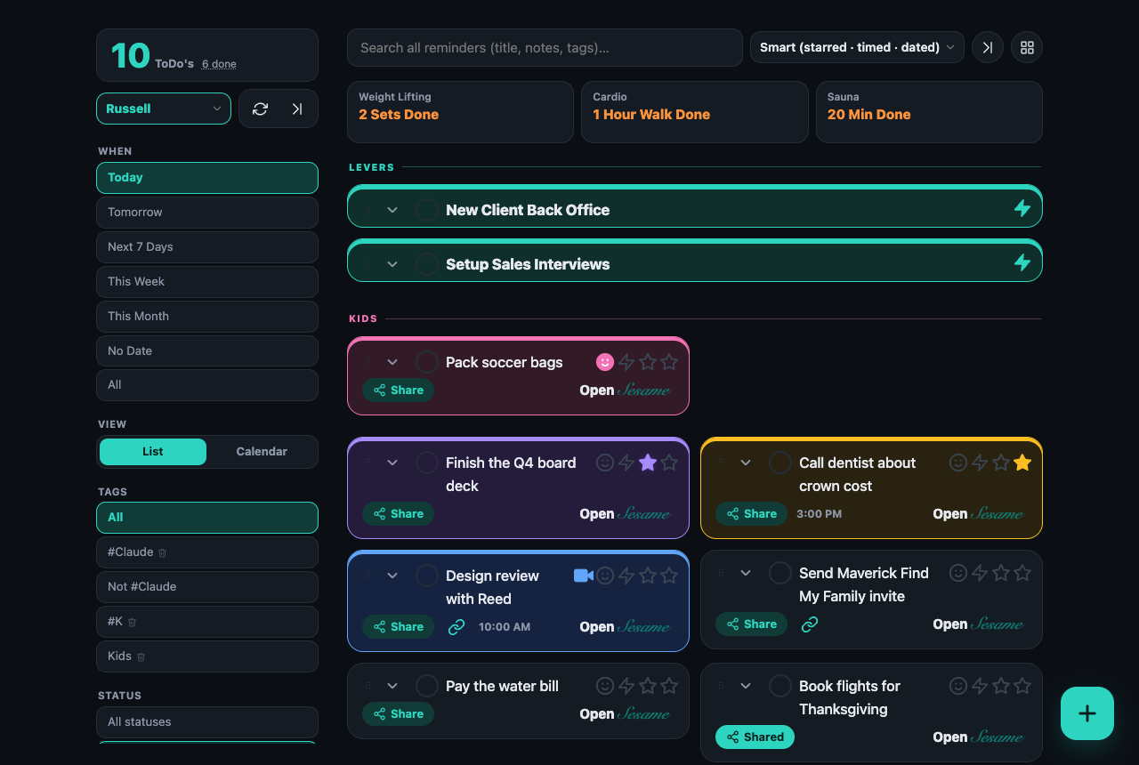
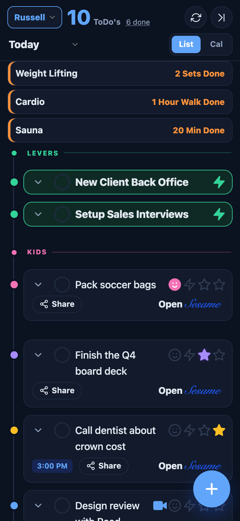
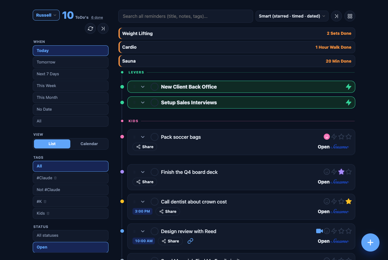
Dark by default, built for the phone in the evening. Amber count and buttons, glowing colour rails for levers, stars and kids. The dark switch goes fully black for OLED.
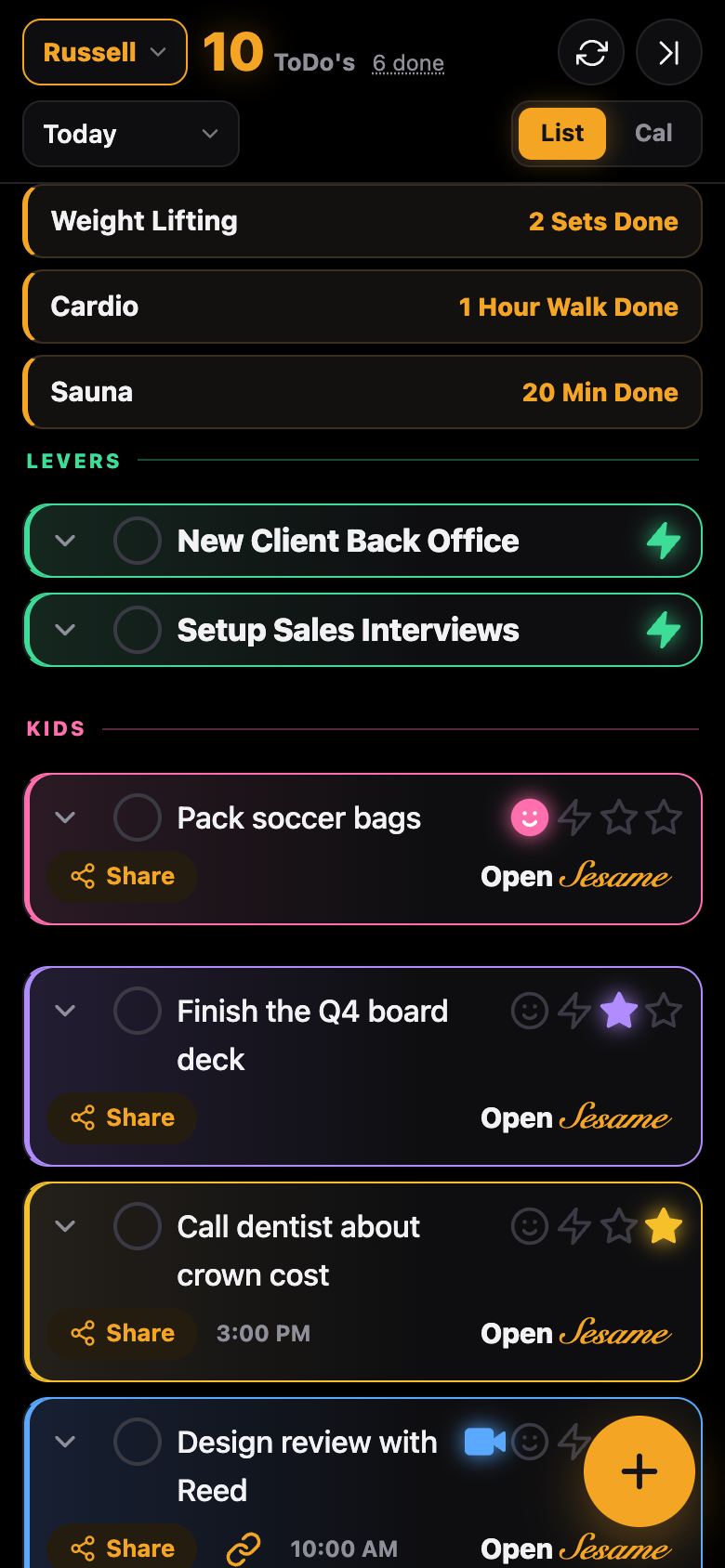
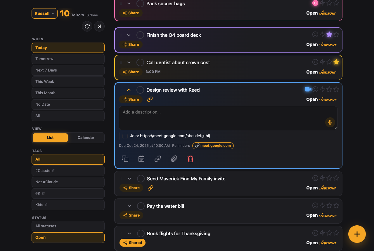
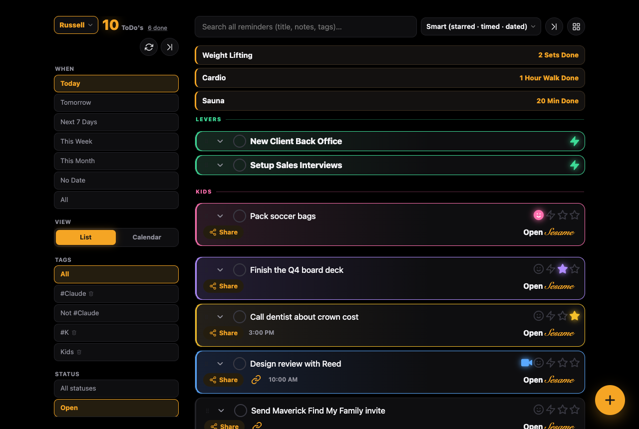
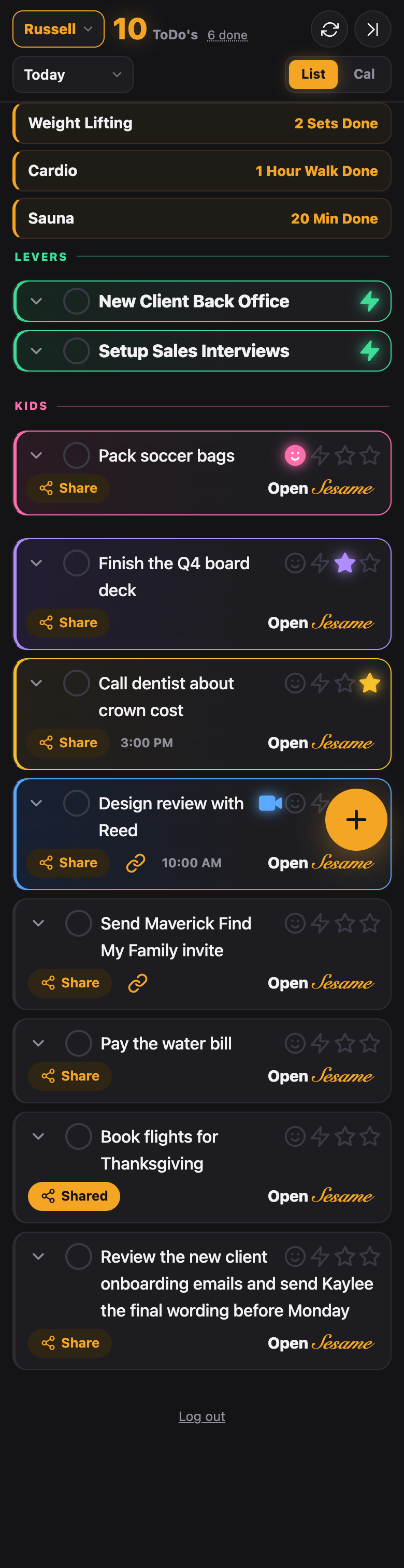
Translucent cards that blur what is behind them, rounded corners, indigo accent. Feels like the newer iPhone widgets.
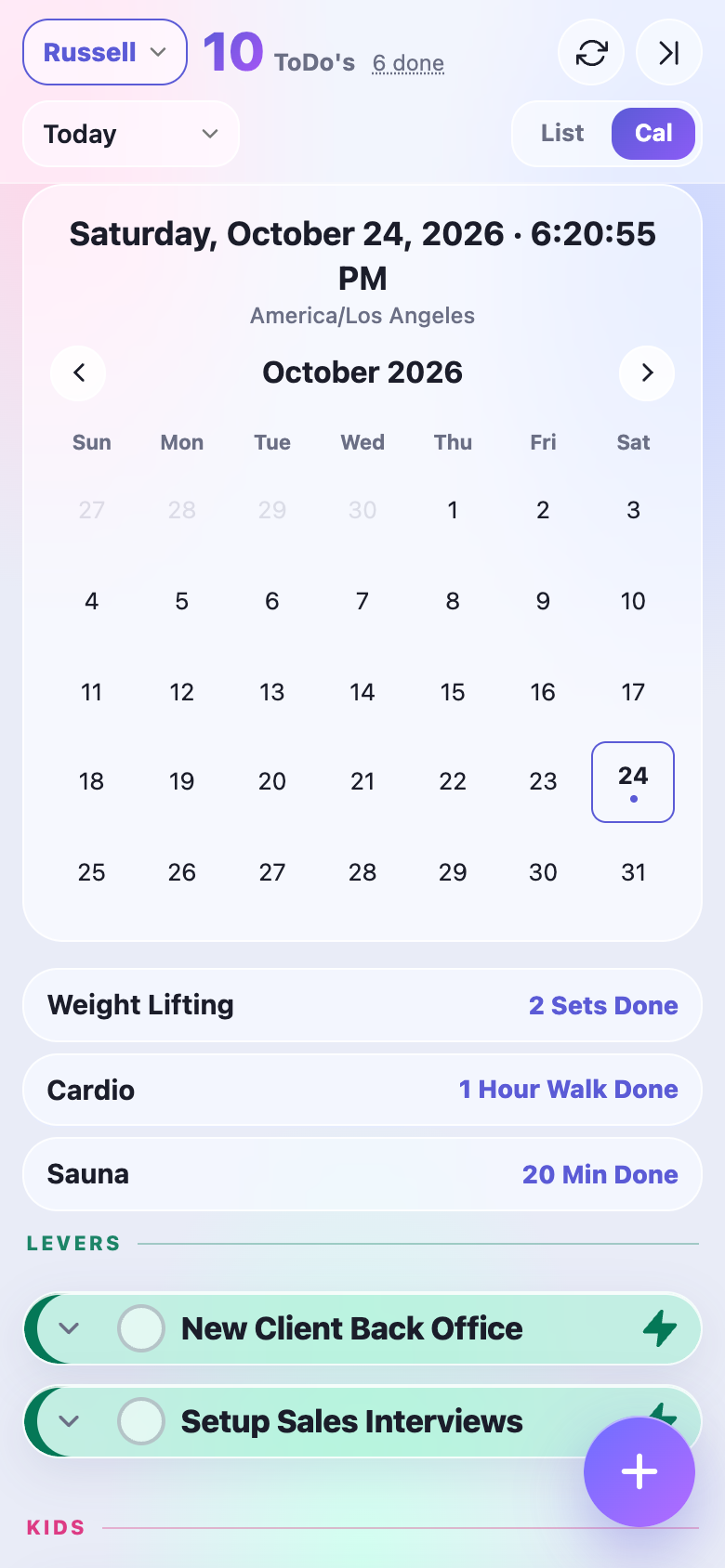
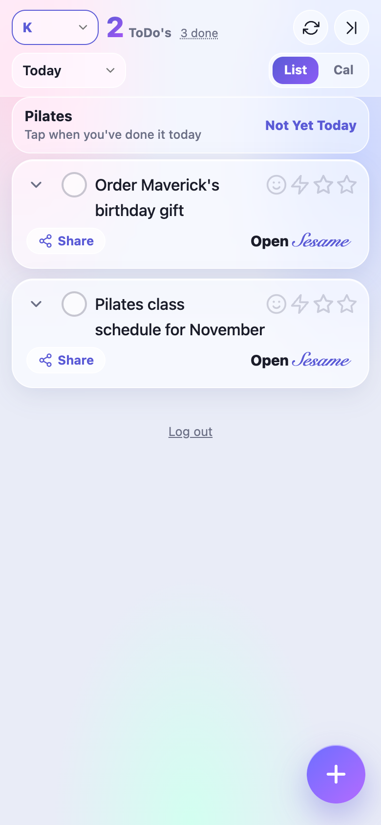
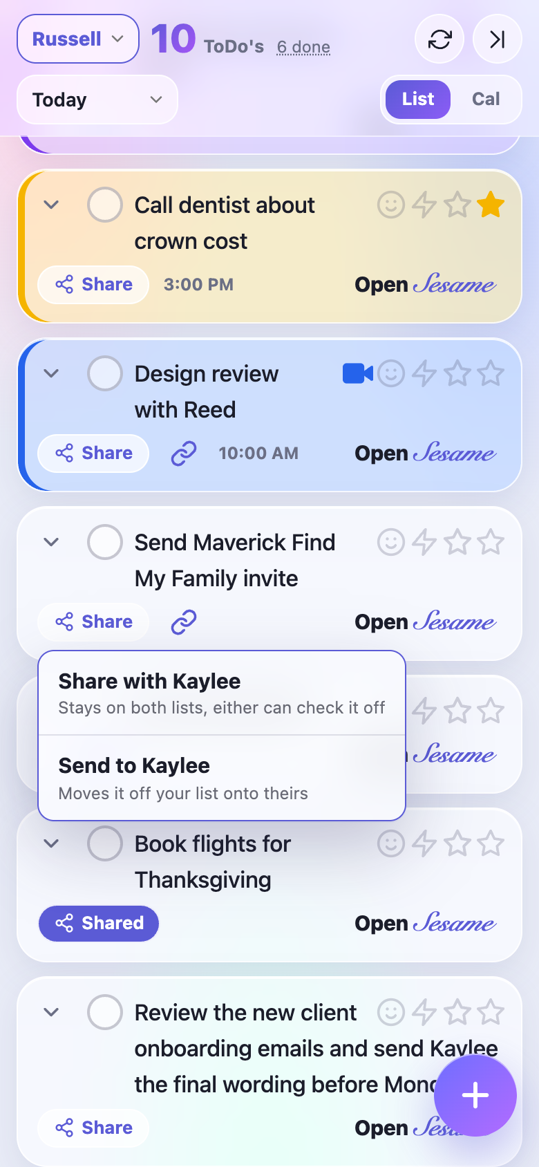
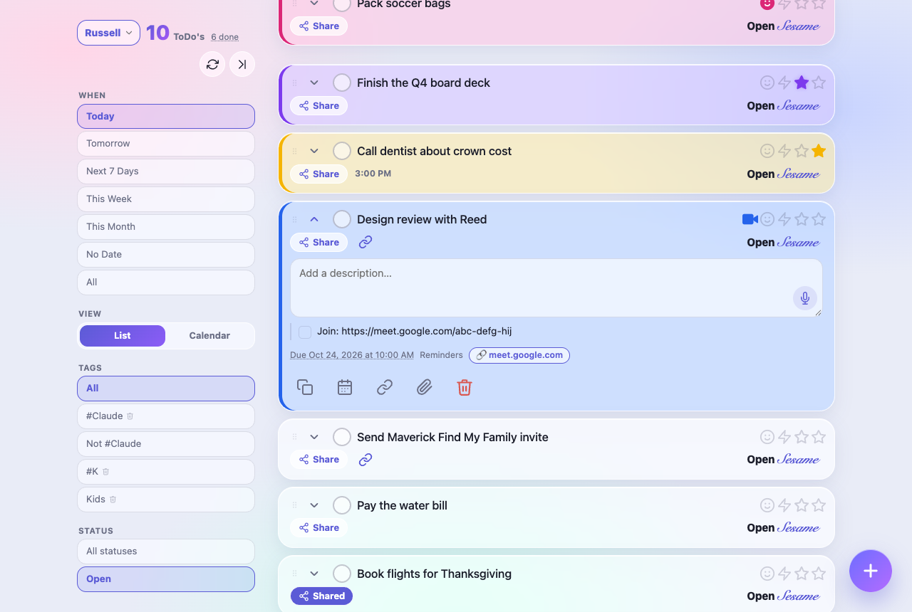
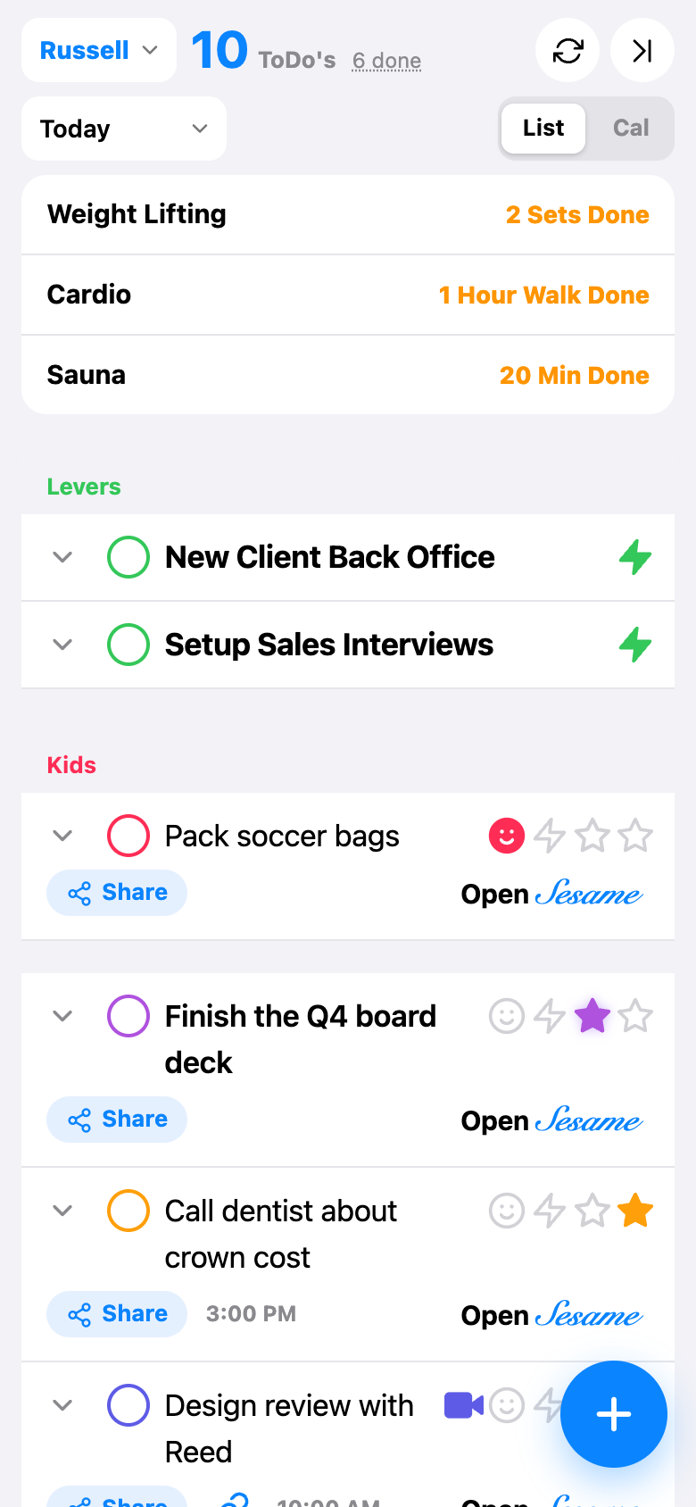
One grouped white list with hairlines between rows, iOS blue, tier colour on the check circle. The calmest of the ten. Placement is the same, the row is just flatter.
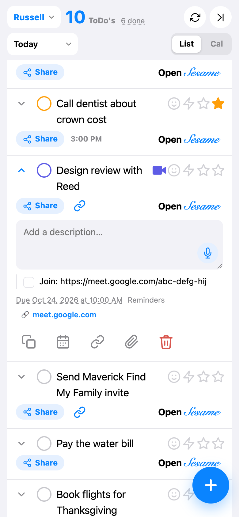
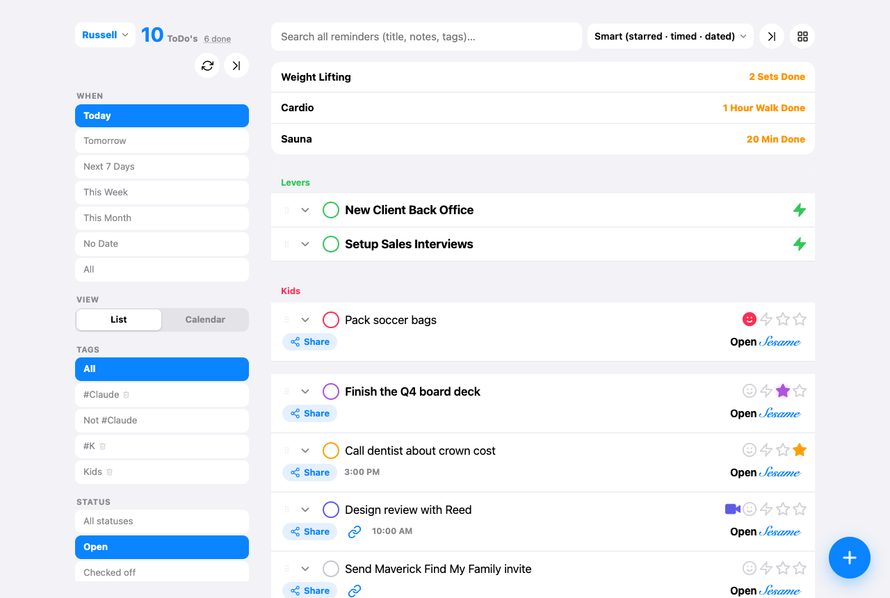
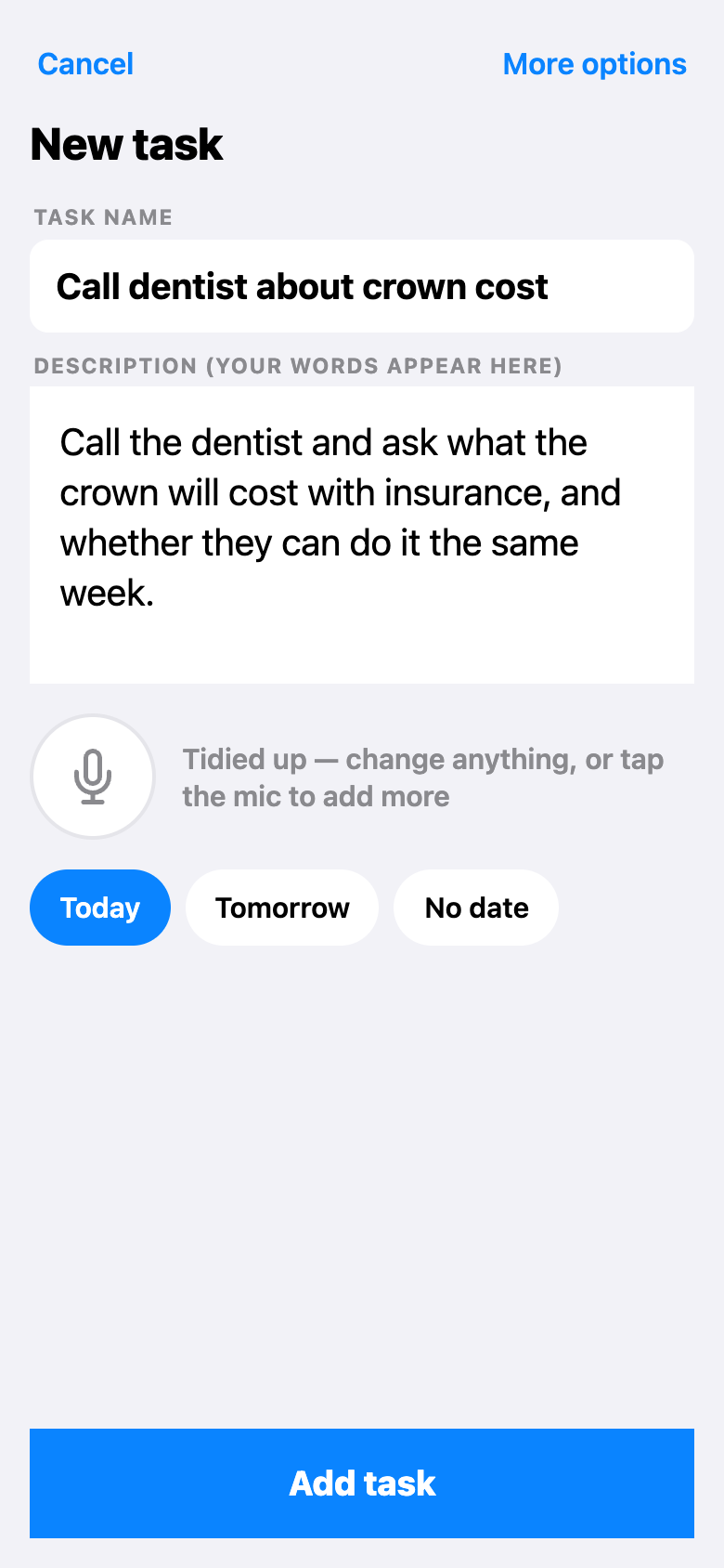
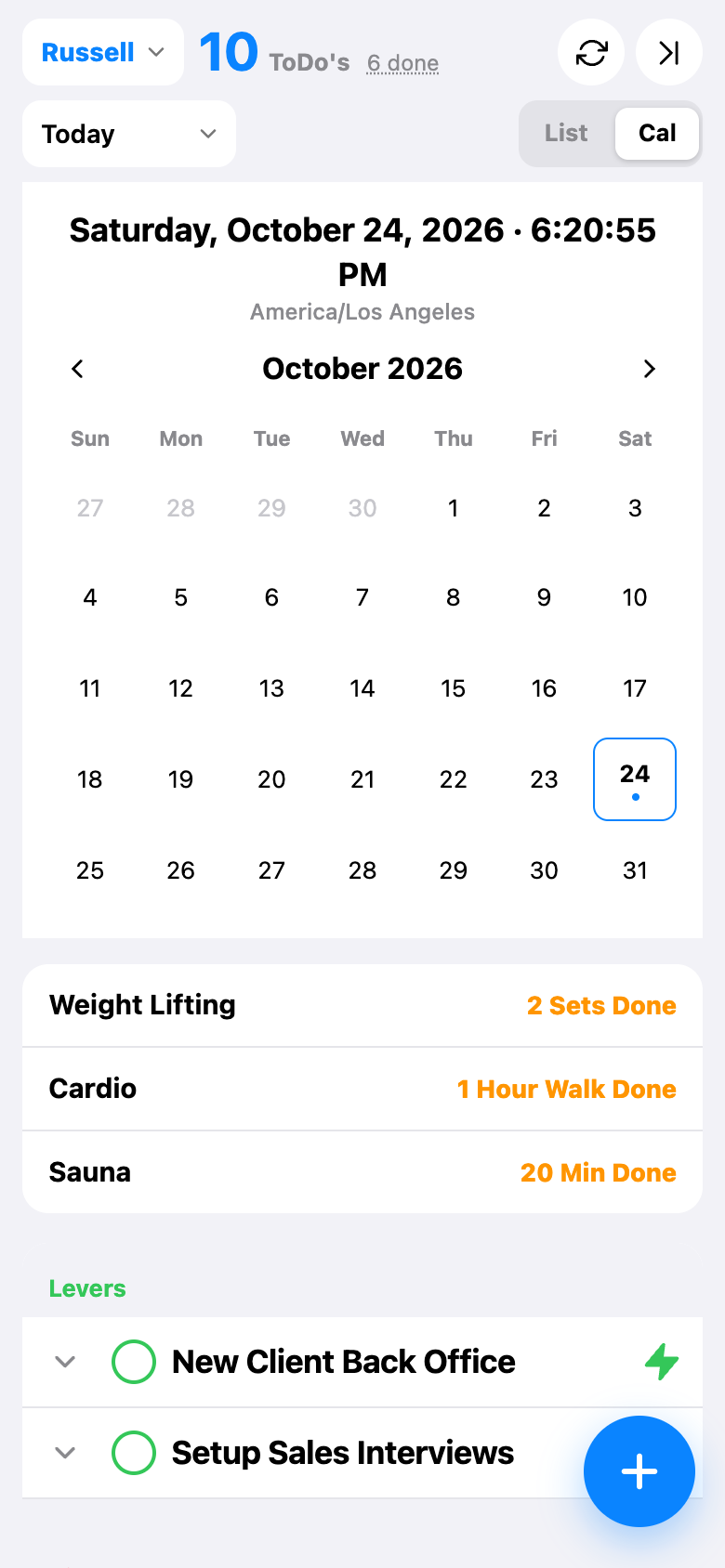
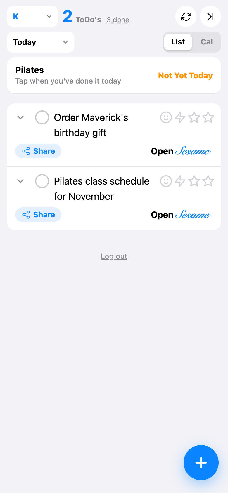
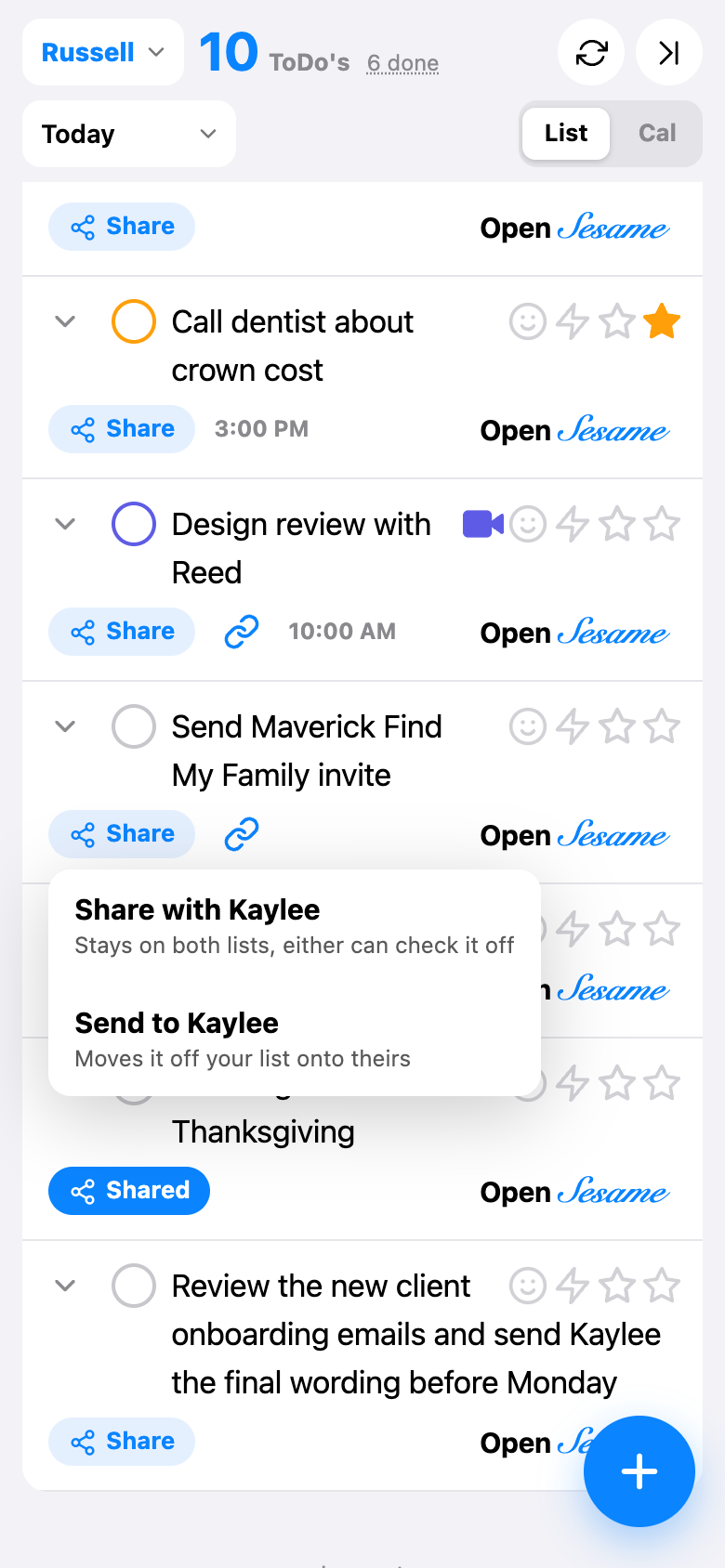
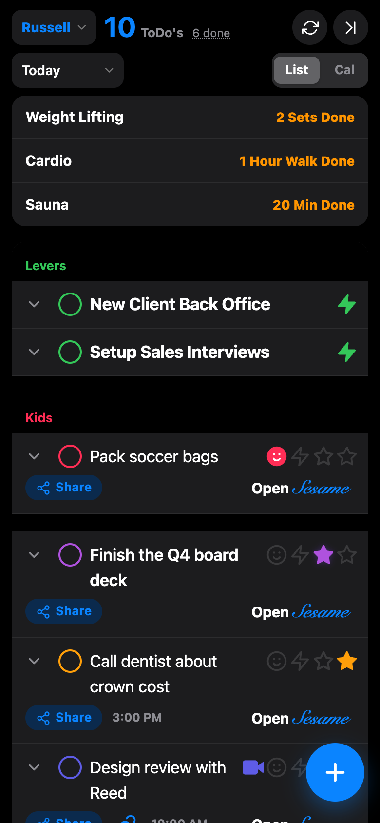
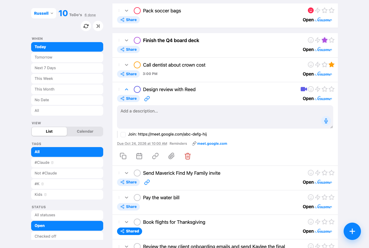
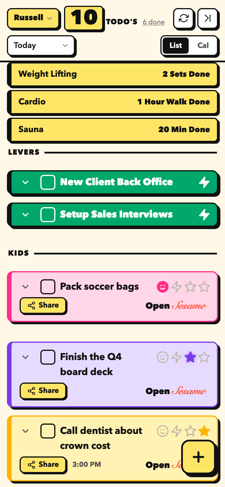
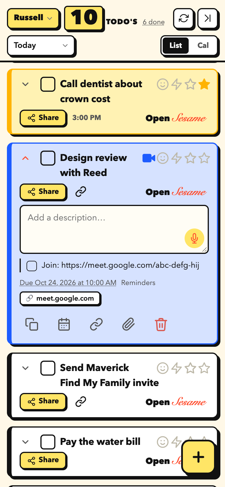
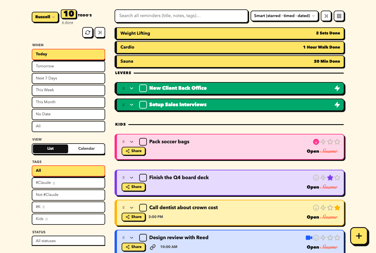
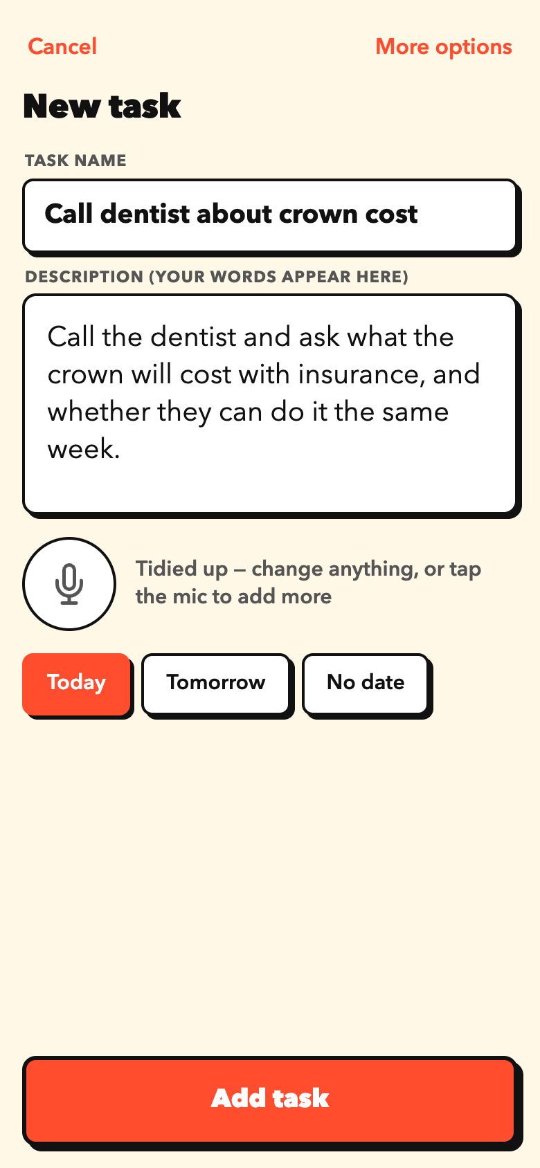
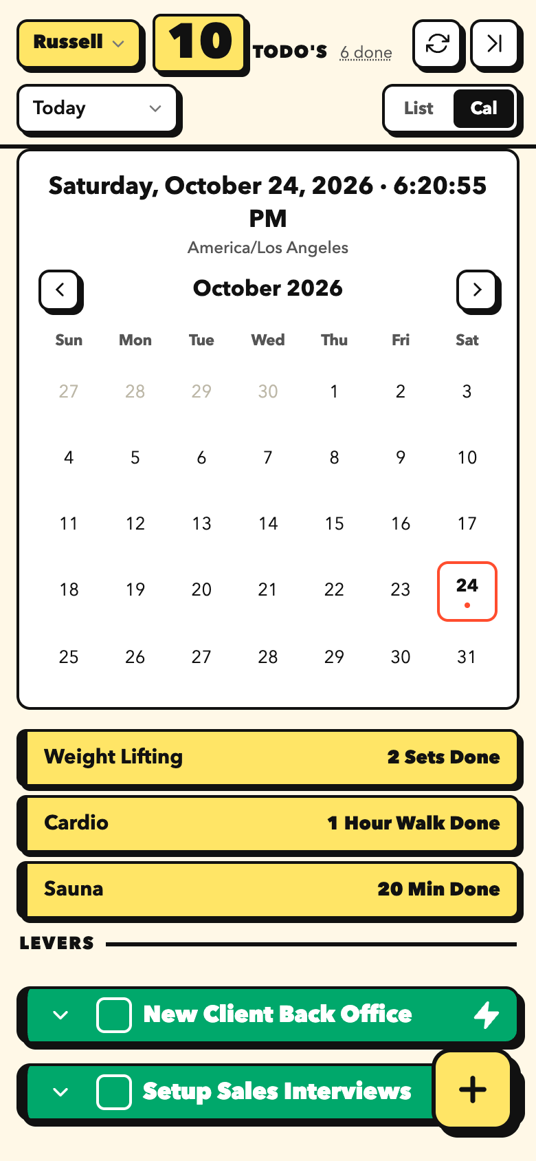
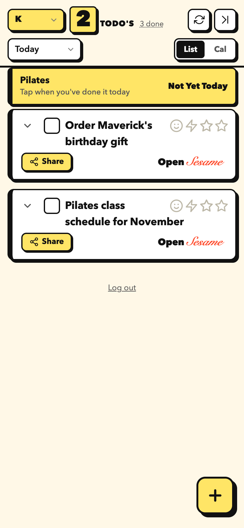
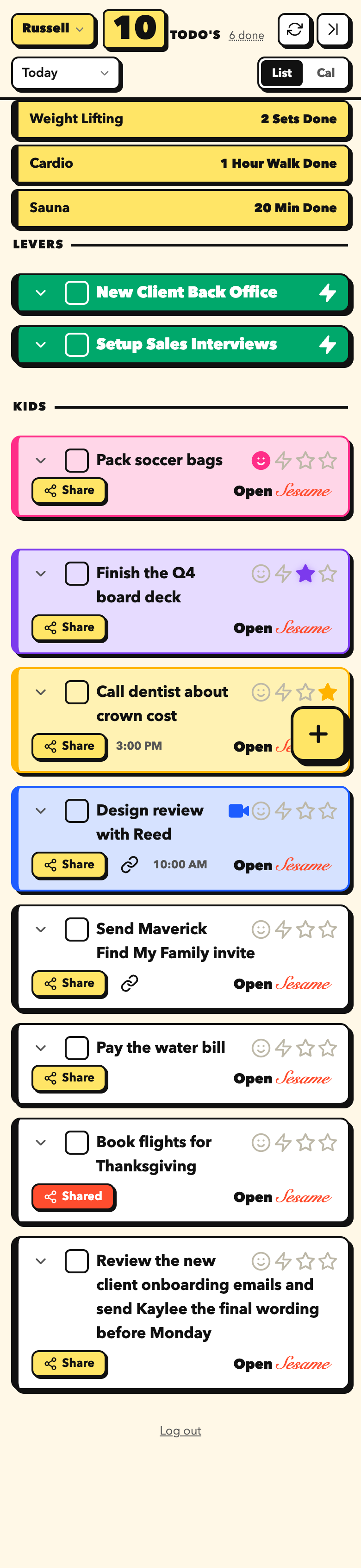
Loud and playful. Heavy headline numbers, yellow highlights, square-ish buttons. You cannot miss a lever.
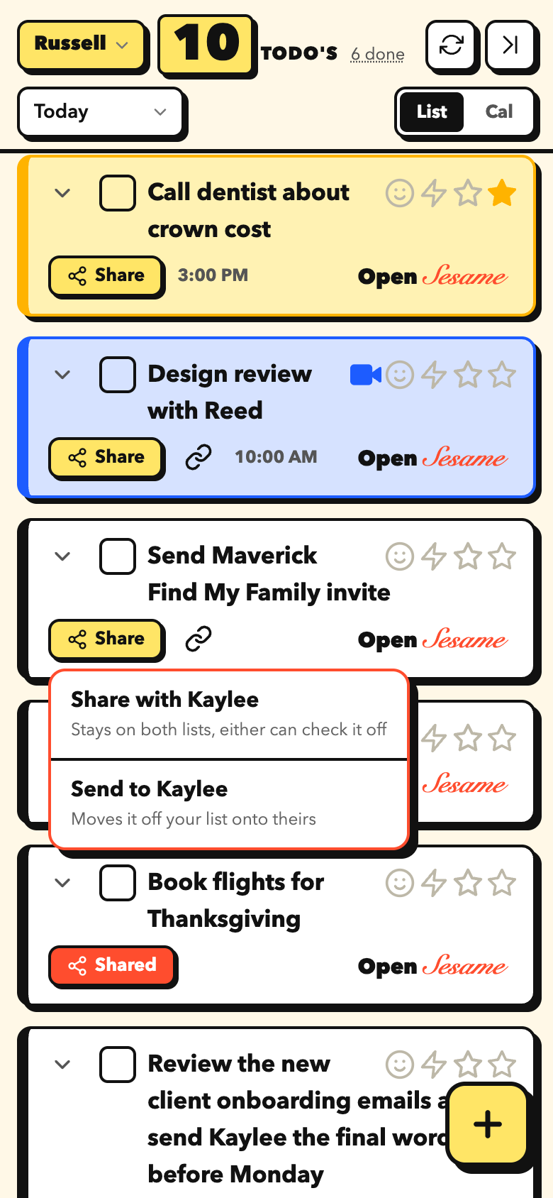
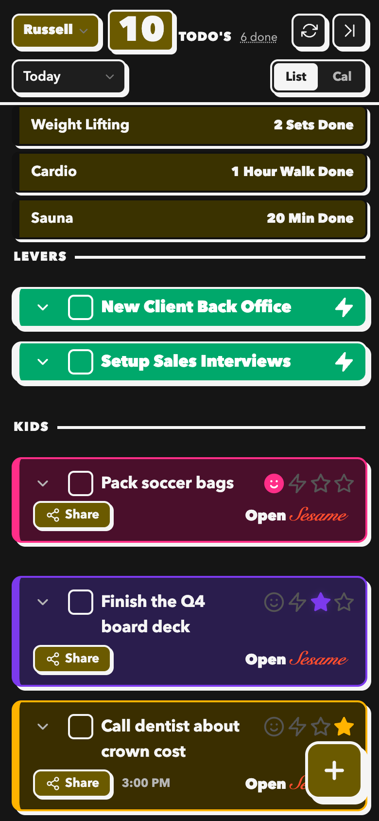
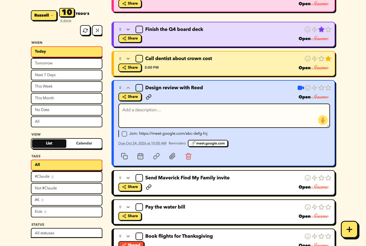
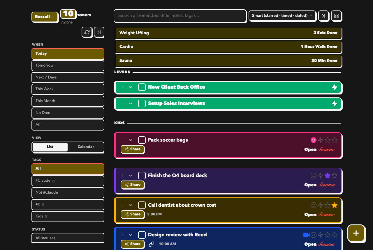
Flat cards, tiny gaps, monospace numbers and labels, health tiles side by side. Built for scanning a long list quickly on the desktop.
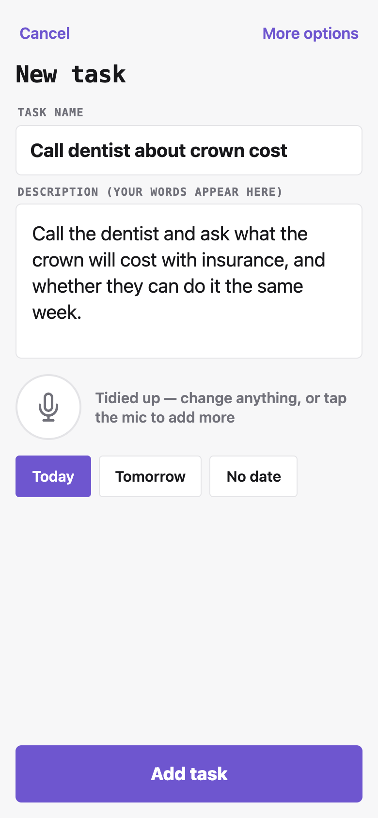
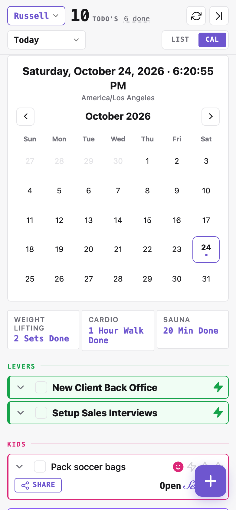
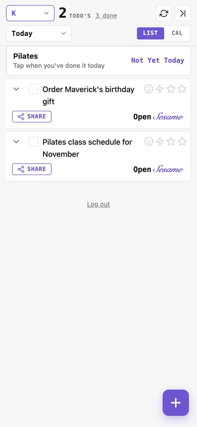
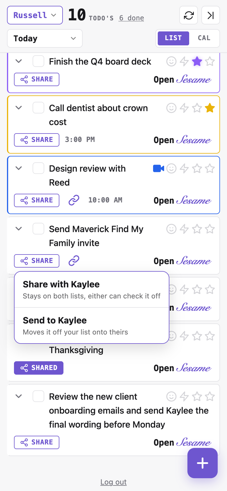
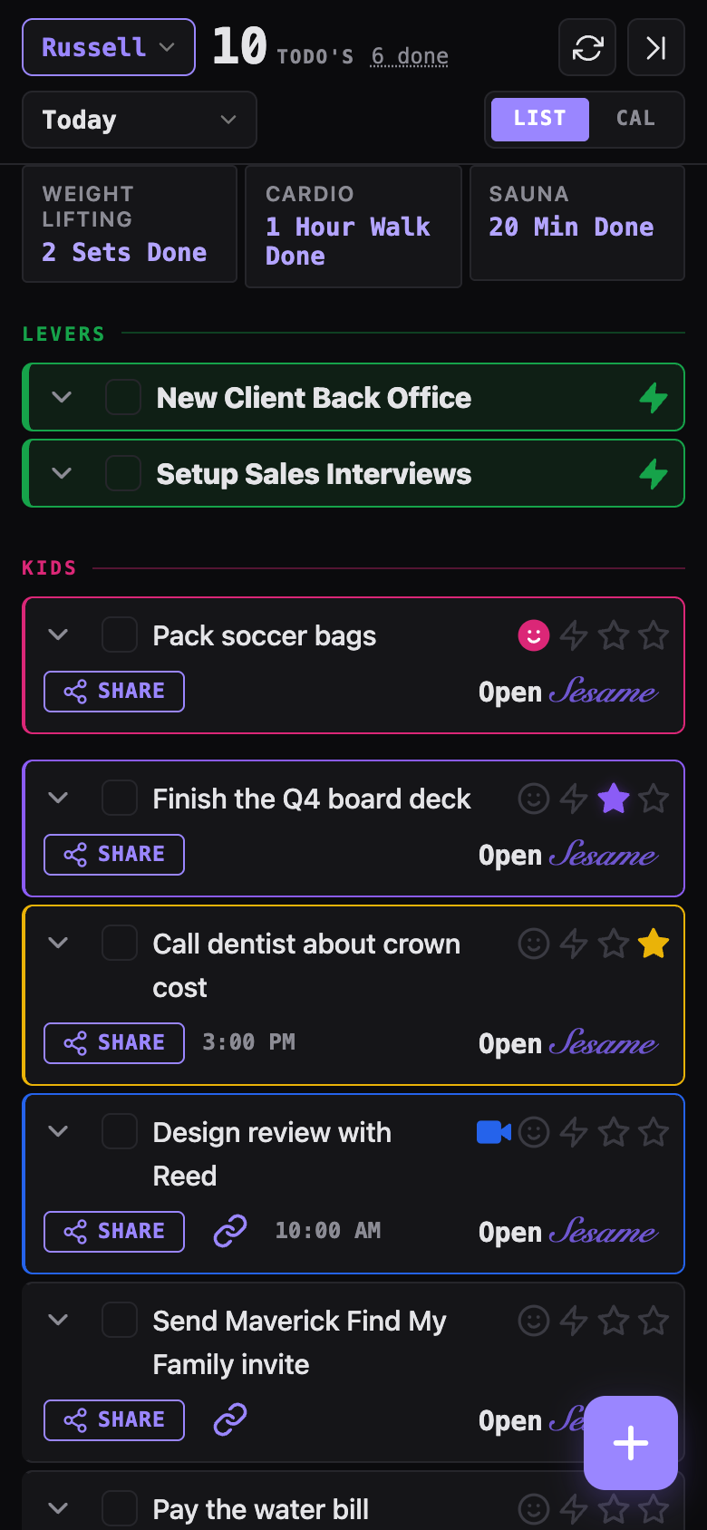
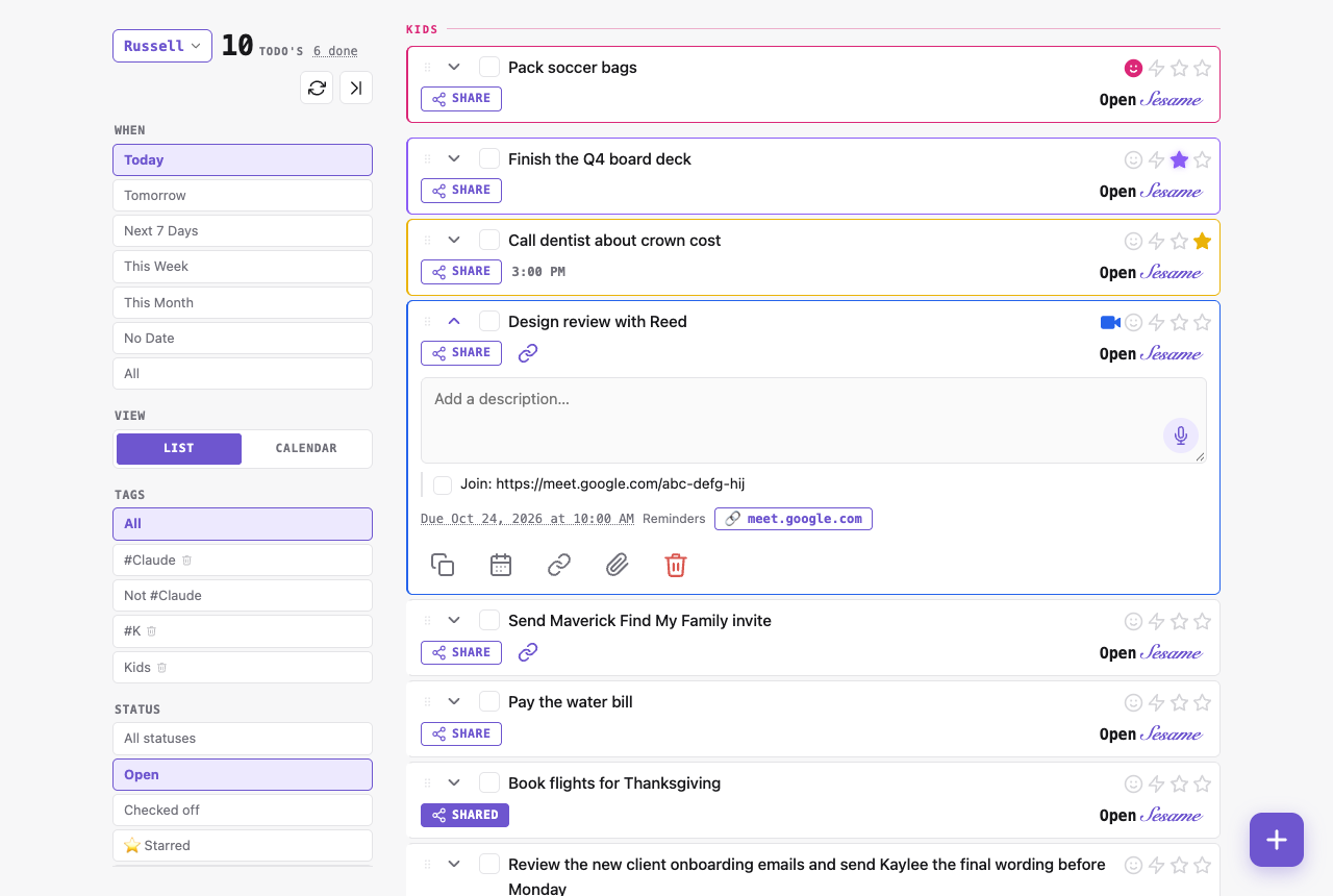
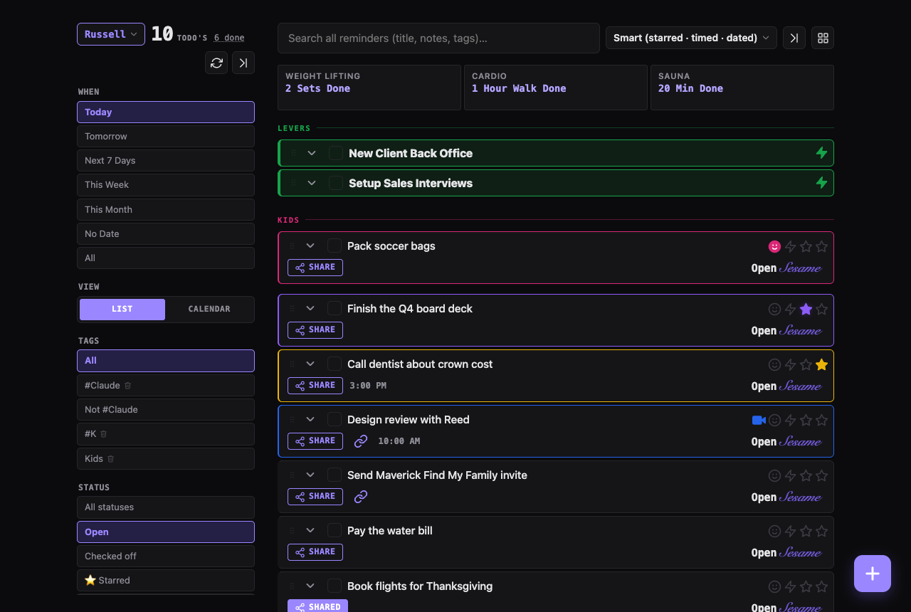
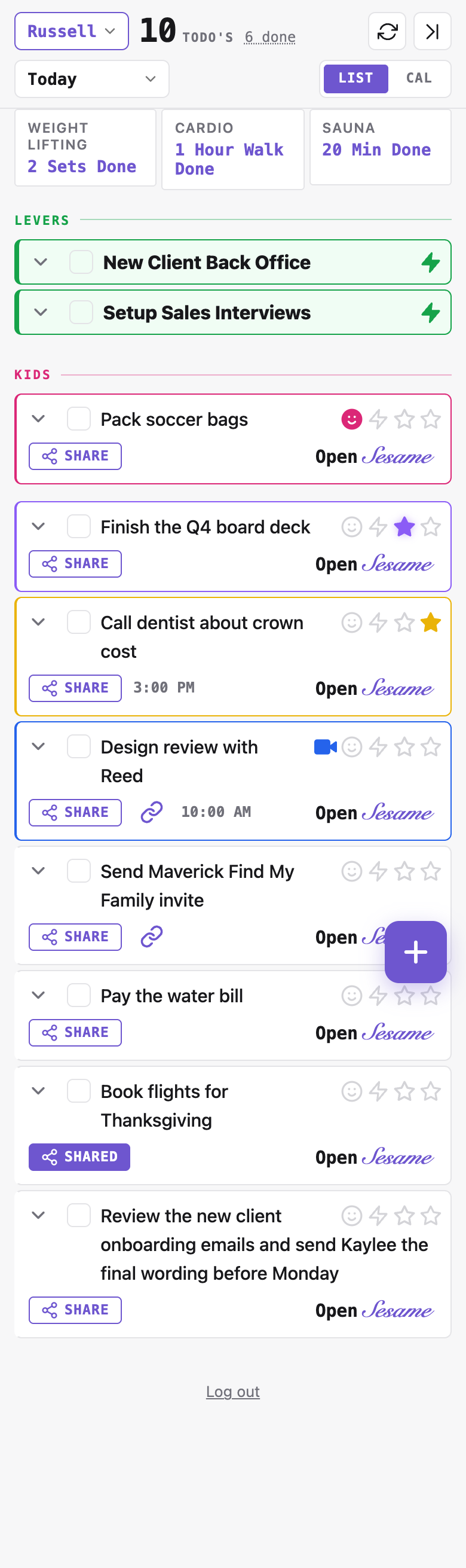
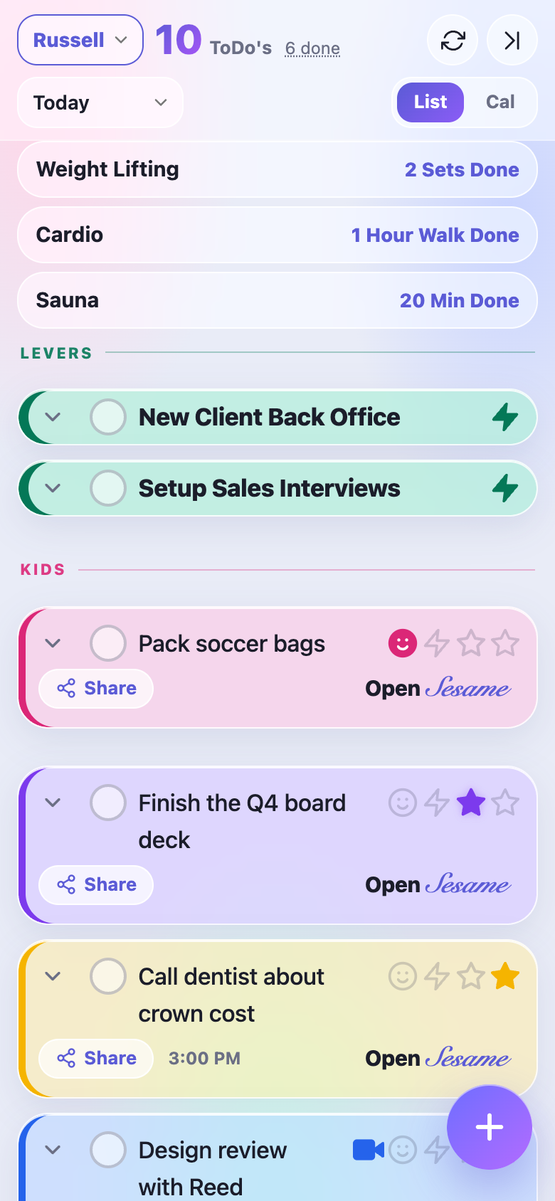
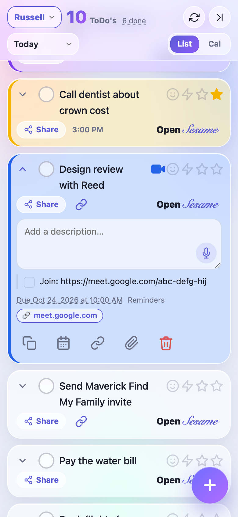
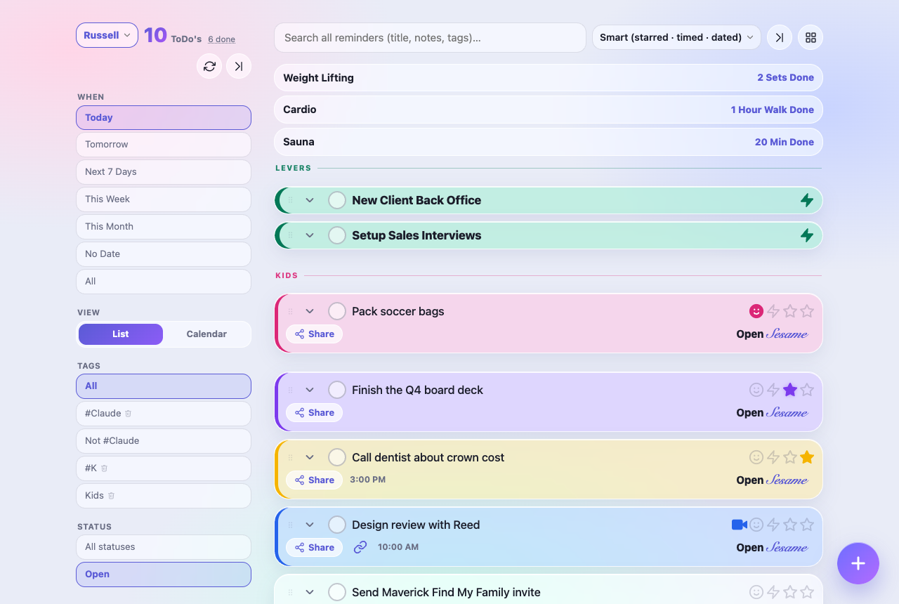
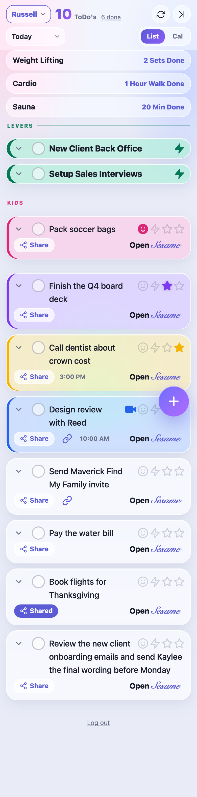
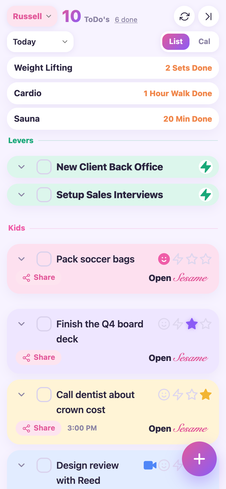
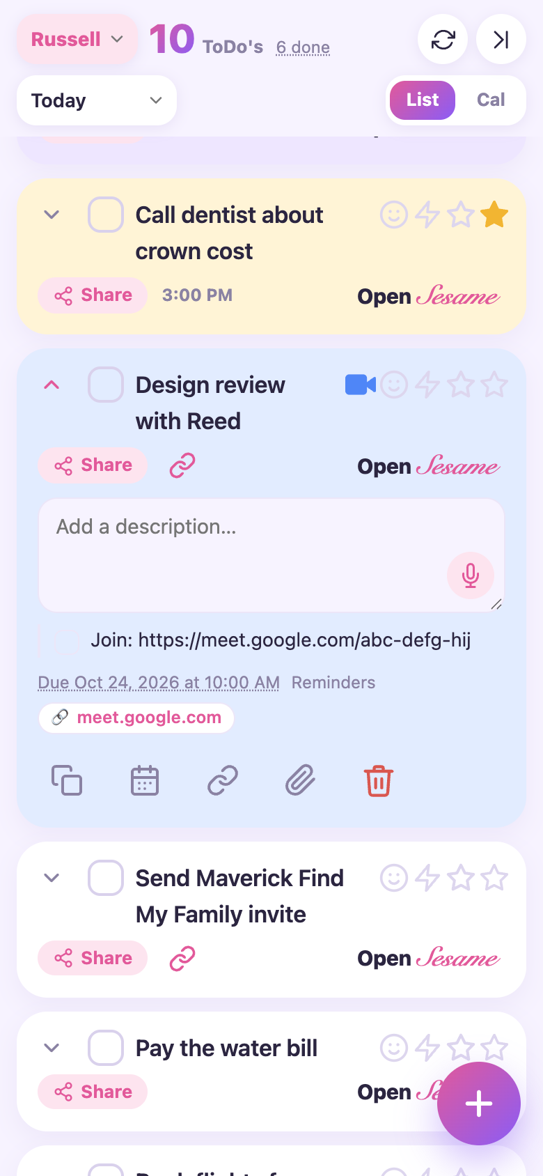
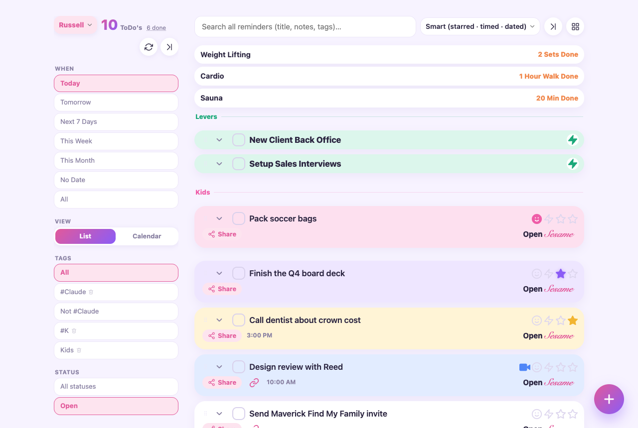
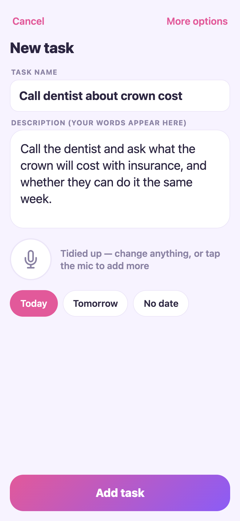
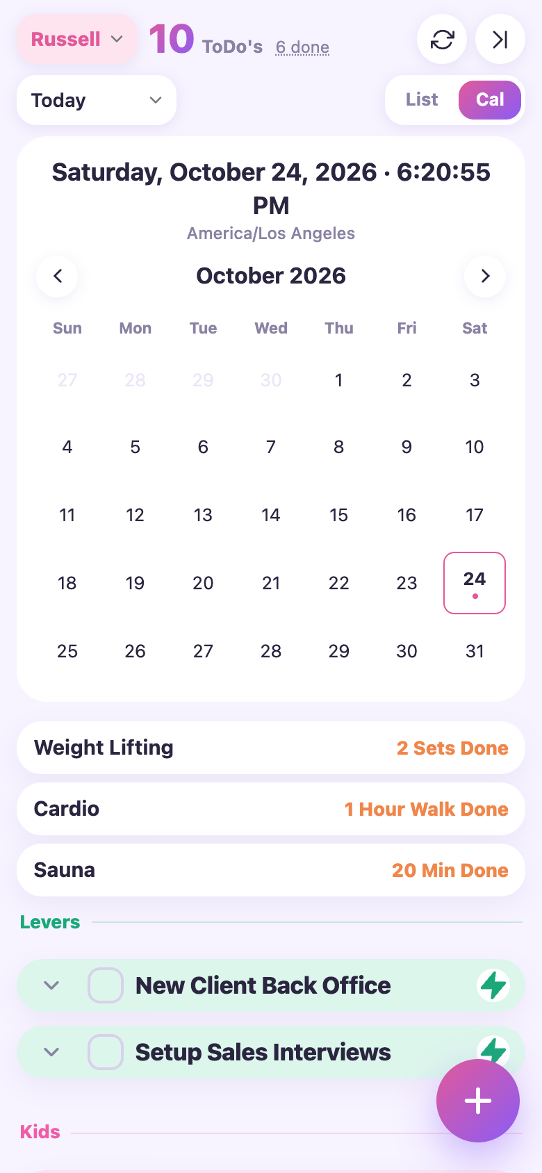
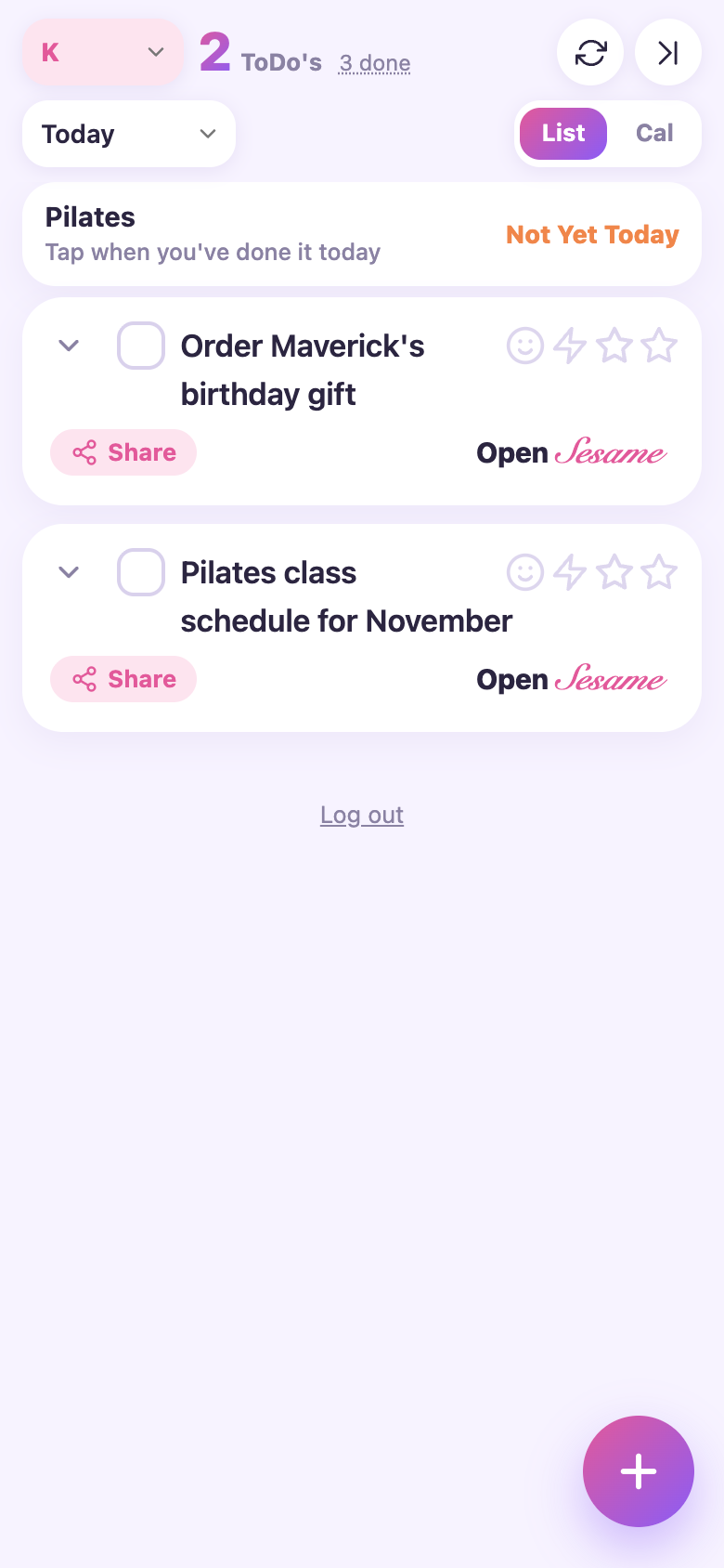
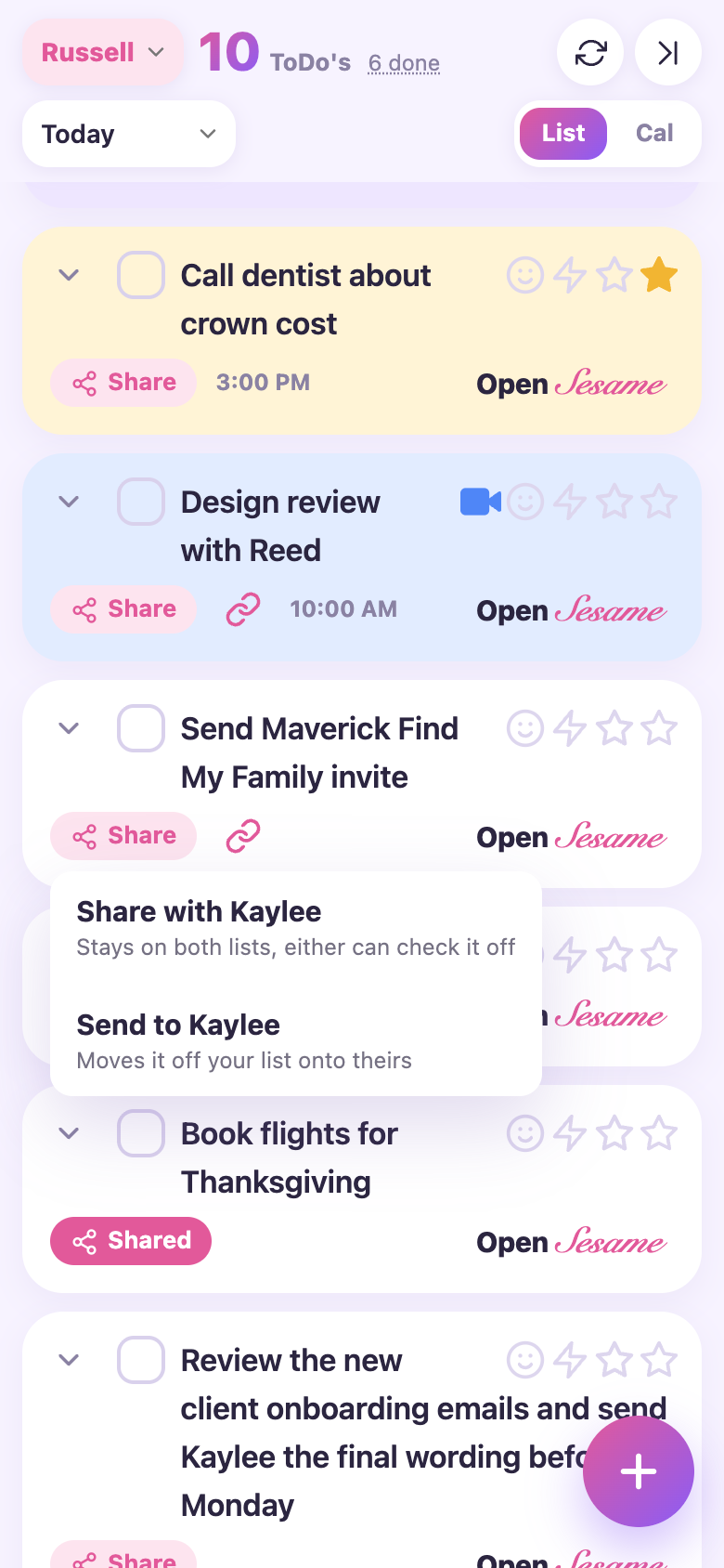
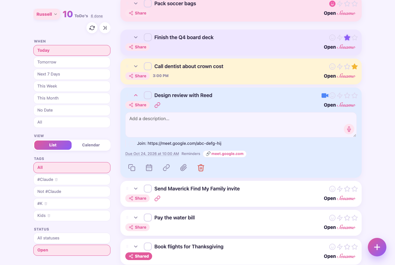
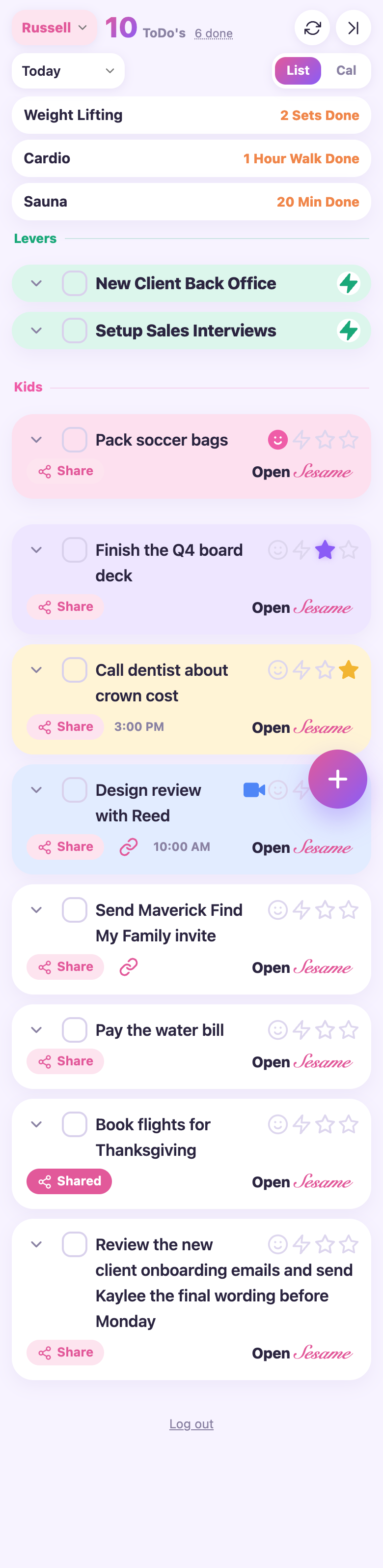
Rounded type, pastel tier colours filling the whole card, a pink to violet add button. The gentlest one.
The header becomes stat tiles, the health cards sit side by side, and on the desktop the task list runs in two columns. Variant: levers span the full width.
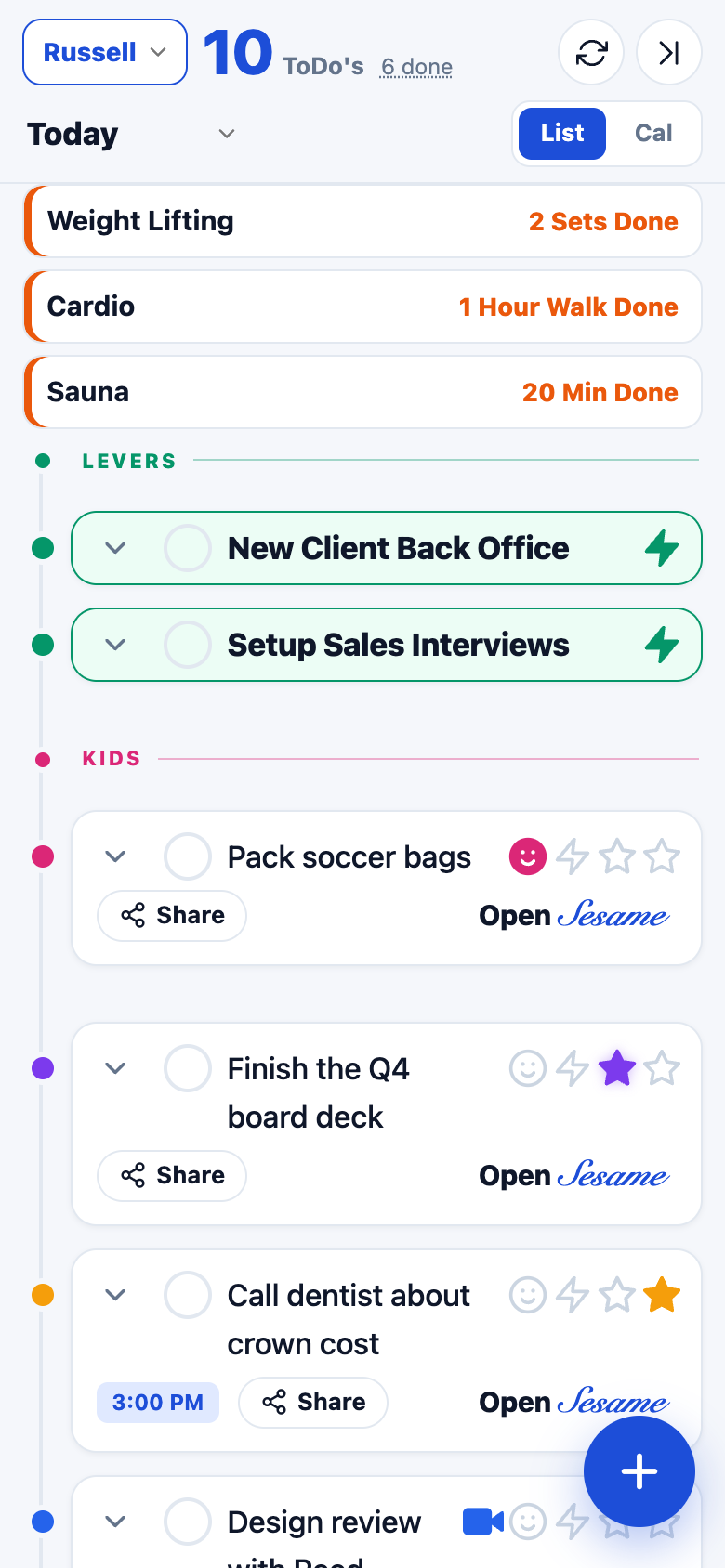
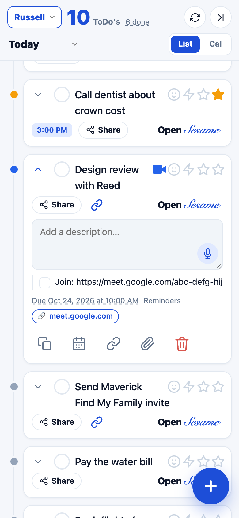
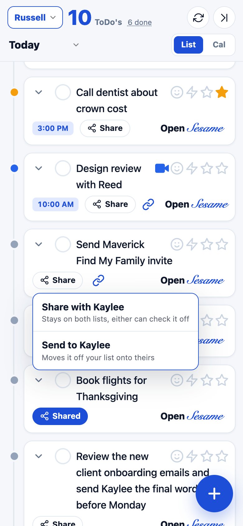
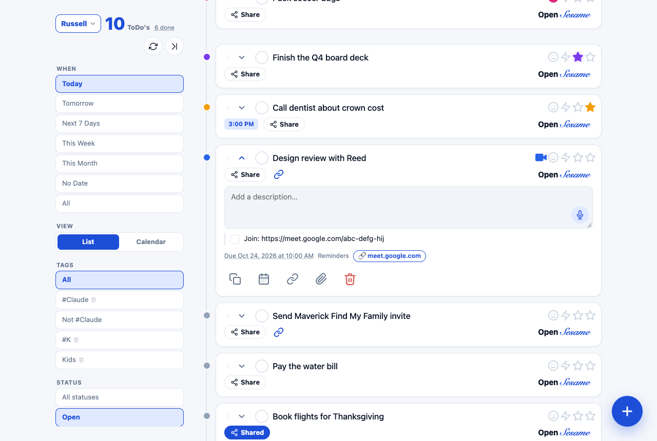
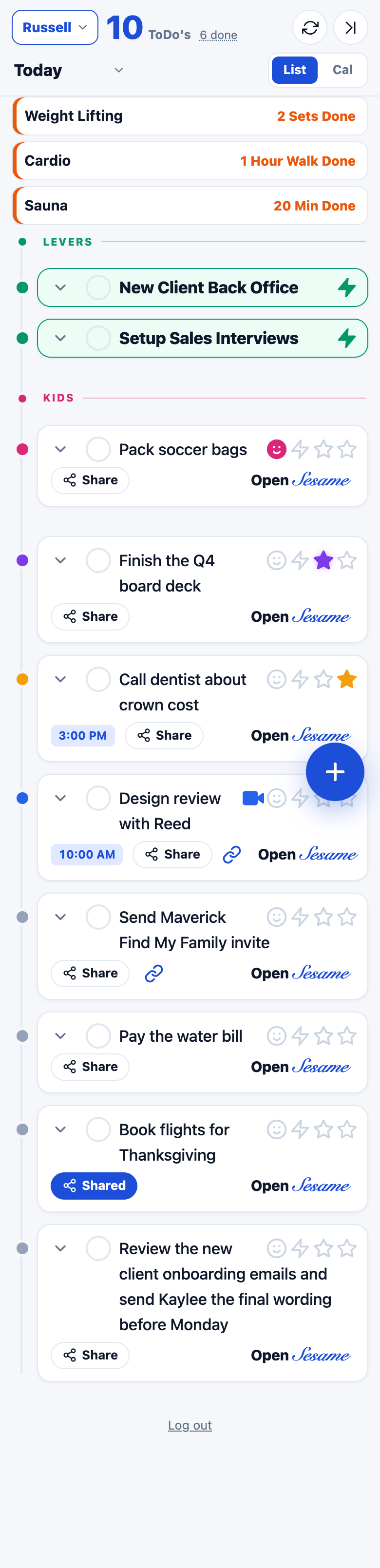
A vertical rail runs down the list, each card hangs off it with a dot in its tier colour and the time pill up front. Reads like a day plan.
Serif titles and numbers, hairline rules, small-cap labels, a deep red accent. The most grown-up of the set.